White Paper
Creative Analytical Brain Illustration
December 21st, 2017

The Art and Science of Building Your Brand’s Visual Identity

As a brand experience agency, our goal at BOLTGROUP is to create moments that matter. But leading up to these brand moments that will win the hearts and minds of consumers, there’s a great deal of work that goes on behind the curtain. While the end goal is to create a truly memorable experience at every touchpoint, we first work with our clients on a strategic level to ensure that every touchpoint has a purpose and meaning. Using this approach, the brand will unfold with truth and transparency.

A lot of folks may think the creative part comes easy, and no question, it is enjoyable. But creative is only effective when careful preparation, understanding, and selection is practiced. This smooths the path toward a strong visual and verbal identity. The late, great Paul Rand once said:

“Design can be art. Design can be aesthetics. Design is so simple, that’s why it is so complicated.”

What appears to be a simple and beautiful visual identity is, in fact, the result of a scientific approach to problem solving. Let’s walk through the science behind the art.

Discover Your Position and Own It

BOLTGROUP always takes a strategic approach to brand development. Without a solid strategy, you’re likely to lose your way. And as with a physical structure, a solid starting foundation to your brand is the key to longevity. The foundation, if properly structured, will be the bedrock that holds up your brand’s ecosystem, both internally and externally.

Part of this foundation is your brand’s position in the marketplace. Your position should be unique to your offerings. It’s often not enough that you sell a great product, you must also think about what void that product fills in the lives of your customers. Position your brand in a way that sets it apart from the competition. Doing so builds customer retention by identifying with individual needs on a more intimate level.

Little Burros is a long-standing client that came to us as a family business with big ideas to shake up the lawn and garden market. The family spends lots of time gardening on weekends, lugging plants, tools, and gear around the yard. They realized they were making repeated trips to the shed for tools and gear. They tried various carts and caddies from the garden center to make the job easier. Some products got part of the job done, while others offered one feature like a seat or storage. But what was needed was helpful innovation that does it all. So they rolled up their sleeves and created the  first ideal caddy. Dubbing it “Little Burro,” we positioned the brand to have a unique offering in the market. The does-it-all Little Burro.

By positioning the brand as a loyal, helpful, and innovative partner, we were able to fill that gap in the market. Fewer trips to the garden shed or garage helps you get the job done faster and more efficiently. This positioning was then unpacked into a visual library of iconography, supporting the idea of the helpful sidekick.

Little Burros Icons

Know Your Audience

You’d think this is obvious. But you might be surprised at how many brands don’t truly understand their customer audience. Or understand what customers want when it comes to a product or service. This is where research is your powerful tool. We can’t overstate the importance of quantitative and qualitative research on both the brand and product side of your business.

On the brand side, quantitative research drives brand development, packaging, retail brand experiences, and so much more. Building and understanding data about how people react to your visual identity, shop, and come to decisions, and then use your products or services, can be vital in elevating the brand experience. Research can be as simple as A-B testing in web, email, or print campaigns, or gathering data at the retail level to understand a consumer’s purchase path. Or on a larger scale, research includes focus groups or eye tracking software to identify which visual cues on your packaging (messaging, color, or imagery) are working hardest for you. This data can help you put your product out front and manipulate the buying cycle.

At BOLTGROUP, we encourage clients to employ research whenever there is a redefining moment—updating the visual identity, rolling out new products, introducing new packaging, or pursuing new markets. Stepping back and asking the right questions to understand your customers will almost always hone the creative efforts that follow.

Powerful Graphics Backed by Data

So, you’ve gathered your data and have a plan in place. Now what? Data can not only steer the creative process, it can also become the creative. Use it in your visual identity or in your messaging to validate your brand communications. Convert gathered statistics into bright, stylized infographics. Nothing speaks louder than hard, proven facts to build trust in the minds of your audience.

This type of content is verified to be well received and shared more than other content in social media. According to one study, infographics are “liked and shared” on social media three times more often than any other content. In another report, 37% of businesses named visual marketing as the most important content format, second only to blogging (38%). That’s huge! This same kind of visual marketing power can be at your fingertips with only a bit of research.

Consider our client, FOX Rehabilitation, the largest clinician-owned and operated private practice in the US employing physical, occupational, and speech therapists. Their goal is to abolish ageism through unconventional methods of treating older adults. FOX constantly tracks and retains data surrounding their evidence-based treatment. Over the past year, we worked closely with FOX to update their brand identity. Throughout, we encouraged the use of their powerful statistics as infographics on their website and social media platforms. By keeping the design clean and simple, with the payoff clearly visible, we engaged readers more, and inspired conversation and sharing across multiple platforms.

When people remember only 20% of what they read and 80% of what they visualize, turning data into art is a great way to retain customer attention.

The Science and Impact of Color

Speaking of visuals, color is one of the most recognizable and remembered elements of communication. So much so, that we’re inundated with everyone’s “Color of the Year” each December. Companies are picking from among winning hues that will be the most influential in the marketplace.

Sherwin Williams unveiled Oceanside as their 2018 winner—a bluish-green, jeweled tone hue. They describe the color as “a bridge between familiar and foreign.” The color was chosen for its versatility and ability to “harmonize with other diverse color groups.” Perhaps something we need in the coming year.

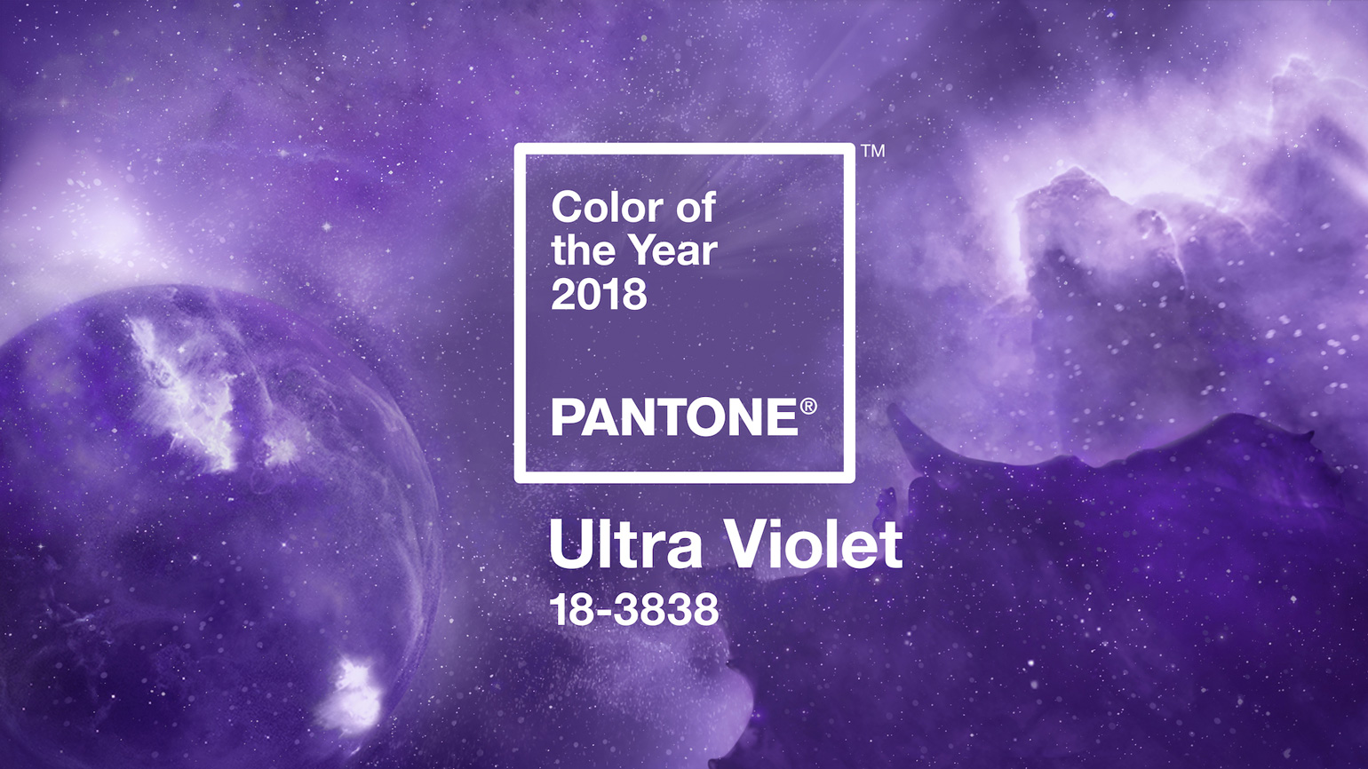
pantone color of the year 2018

There is also Pantone, a color collection designers must always consider. Pantone unveiled Ultra Violet as their 2018 Color of the Year. Not because it was visually appealing or felt cool or calm. In fact, just the opposite…Ultra Violet has energy and makes a bold statement. Pantone describes the color as “provocative and thoughtful,” and notes that it “communicates originality, ingenuity, and visionary thinking that points us towards the future.” Think about that…it wasn’t simply a subjective decision, but one driven by careful observation, research, and a study of the marketplace. With everything in the news this past year, Ultra Violet is the energy we need to push forward.

That same sort of thinking should be applied to your brand. BOLTGROUP encourages clients to look at the science of color and consider its impact on the market. Because color can have emotional ties fixed to the individual, we know that one consumer perceives color slightly different from another. So your brand’s palette selection is far more than preference—it is research, data, science, and, of course, art.

Your color palette should reflect who you are, your unique position in the marketplace, and the personality of the brand. And you may need to go one step further. For example, we’re currently working with a brand that manufactures containers for landscape, marine, and military markets. In a study of the competition, we saw lots of reds, blacks, and yellows crowding the visual space. We thought, why follow the crowd when you can step out front and lead with a bold new look. We carefully selected a strong, world-class visual identity rooted in a rich, deep marine blue. A blue that is bold, yet trustworthy. We paired this with a bright green accent, communicating intelligence and innovation. Since color increases brand recognition by up to 80%, it’s likely this move will create instant recognition in this client’s consumer market.

The art and science of developing a strong visual identity requires preparation, understanding, and thoughtful selection. The creative will have truth and meaning when there is science and data to back it. Take time to do the homework. Research your audience, find your unique offerings, and then exploit them. Don’t be afraid to expose your numbers, but do so in a visually appealing way. And finally, consider color as your secret weapon in building brand recognition.

Let's Connect

Are you in a position where a pivotal shift is required to hit your goals? We can help.