February 14th, 2017
Retail Packaging: Brand Purpose and Truth Should Come First
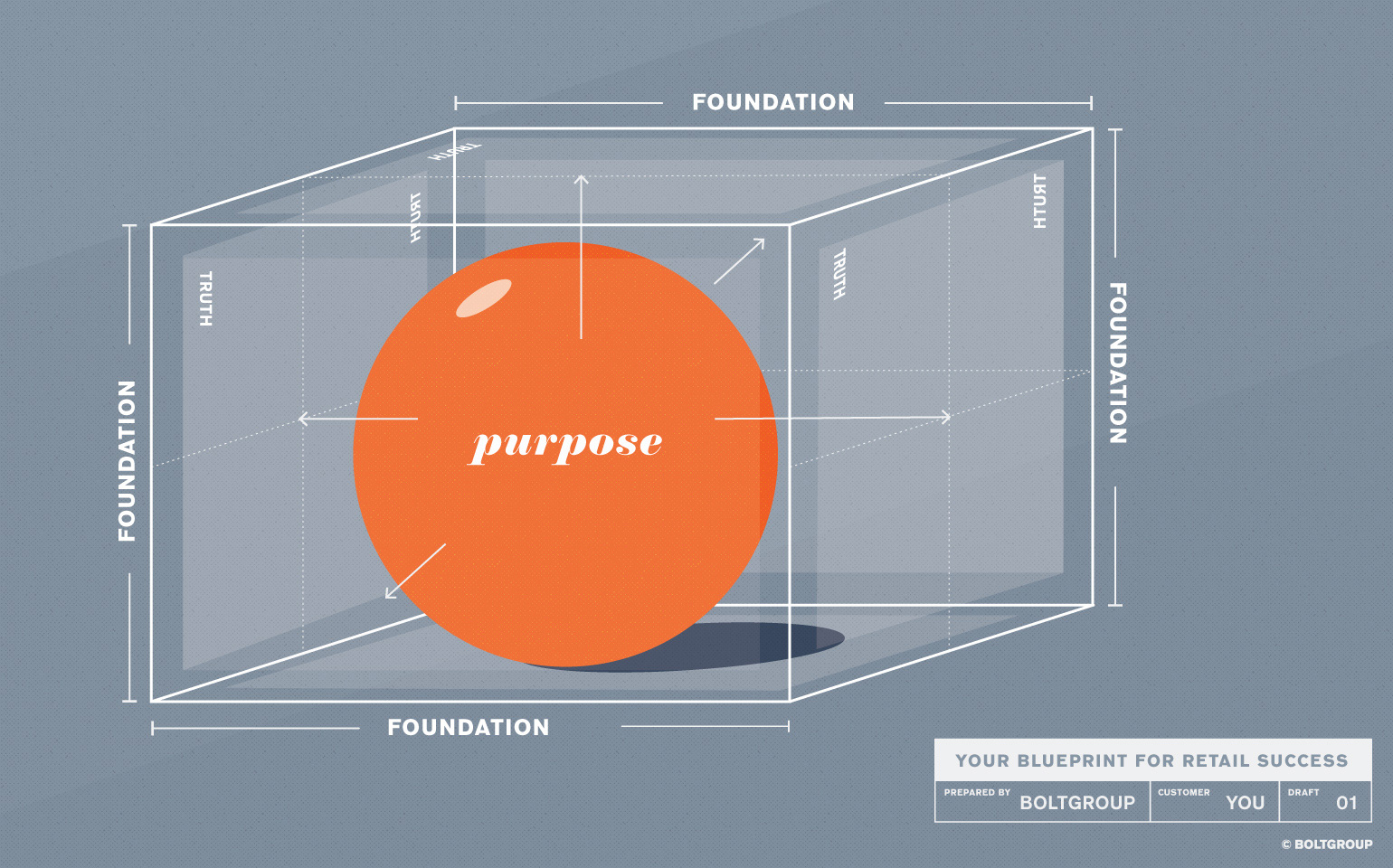
In today’s retail market the consumer is inundated with choices about which brand or product is best for them. This chaos of options feeds a desire for simple, authentic experiences now more than ever. Essentially every stage of the purchase path is a moment of truth, one where the consumer holds the power.
Those opportunities for truth that draw a consumer in also create loyalty. Therefore, it’s crucial that your business instill purpose and truth at all touchpoints of your brand. Since product packaging is often the first and most intimate experience consumers have with your brand, it is especially important to get the packaging right.
At BOLTGROUP we closely define the very foundation and purpose of what a brand or product does before making the leap into packaging development or refinement. Working to define its reason for existence. What makes the brand unique? Finding this, knowing this, allows the compelling truths of the brand to come forward. Then we create the tools to release it. Our VP of Creative gives some additional advice on that here.
Having this strong foundation and these truths in place helps round out the packaging and give it meaning. For example, if the brand is deeply rooted in a desire to be environmentally conscious, the packaging structure, substrate, and even its carbon footprint must reflect this aspiration. This detail of this development process can also evolve into messaging on the package itself. It adds a next level of transparent storytelling.
Another example might be a brand striving for market leadership. Here the package messaging and language must be lofty and forward thinking. A high-end substrate or printing technique could add a touch of luxury and prestige to the package—elevating the product to a category leader status.
When BOLTGROUP engaged with Archroma we had the opportunity to do it right the first time. Their Color Management division develops unrivaled color formulas for retail fashion customers to meet exacting color demands at any level. Archroma is the science behind the color—the white lab coat.
Their challenge was reaching their key demographic—fashion designers, color specifiers, and color trend analysts—with a method to round out their product offerings. We worked alongside the client to shed the white lab coat and make them more approachable to their key customers. It was a perfect marriage of art and science that resulted in the creation of the Color Atlas by Archroma®.
Using their deep history to generate scientifically accurate color formulas, we created packaging for the Color Atlas swatch library using brilliant color and a scientific cover design approach. Then we extended the physical package design into the online version for a seamless customer experience.
Proof in packaging evolves from both a deeply-seated brand foundation and a defined purpose. Know who you are, what you want to be, and project that honestly in every touchpoint of your brand. Consumers will take notice and will drive your brand and products forward.