Color sells. And it’s absolutely true that the right color sells even better. But that’s too simplistic, because there is more than one right color for your product, your experience, your brand, and your customer.
So how do you choose the right color? It’s all in the execution. I can show you a trending color forecast for your industry, but without an application strategy, you’re not using your color power.
Strategy is Key—The Why and the How
It’s always exciting to see Pantone’s color of the year forecast. They just announced a beautiful Classic Blue PMS 15-4052 as their color for 2020. But for most brands, you need to look beyond 12 months. Some industries require as much as a five-year color strategy. Consider your logistics: what lead time do you need to plan and produce your product and launch your marketing? The further ahead you look, the more time you have for implementation. And the further forward you look, the more crucial your forecasting methodology becomes.
A solid forecasting strategy considers which future color directions will resonate most powerfully with your consumer and brand. Translating color into a variety of materials, textures, finishes, and technologies is a critical part of its effectiveness. That’s why your application guidelines have to allow for creativity and flexibility.
Even more critical is translating a trend-forward color into an appropriate hue for your product or industry. For example, if a warm, mid-range, purple-leaning blue is forecast as one of the essential colors for 2020 (let’s say Pantone Classic Blue), what that means for your product or brand is that warm-based, mid-value blues are important. The intensity of that color for your product depends on a variety of factors. For some, it might translate to a silver with purple-infused blue undertones. For others, a vibrant and deep warm blue will be the best choice.
Now, I’m going to suggest something controversial: there is more than one “right” color for your product / brand / experience. But this is excellent news: it means you have options and can evaluate those options as they relate to your brand, not just based on color trend. Make your color selection part of your design thinking process. It all goes back to the pillars of your brand. Find those compelling truths inherent in every touchpoint of the product and brand experience. Here’s a bit about building those compelling truths: https://boltgroup.com/building-brand-values.
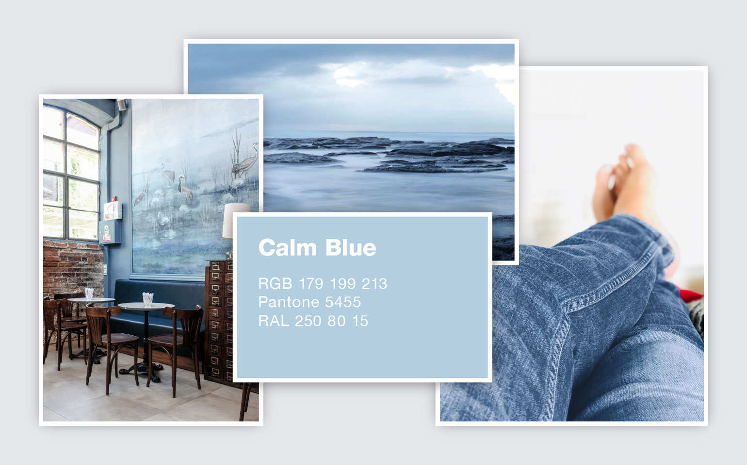
Let’s get back to the fun (and meaningful) question: what is one color that will trend forward in 2021? For North America, one answer is a soothing blue I call Calm, a soft, pale blue filled with positivity and light. Calm is a breath of fresh air—light and airy and tranquil—a cleansing breath in our over-scheduled, over-curated lives. Our desire to find synergy and balance with work, home, play, and technology will fuel this soothing calm blue that hovers between light blue and soft gray.