Blog
June 9th, 2026
What Is Visual Brand Language?
Chapter 1
Walk the grip aisle at any major golf retailer and you will understand, in about thirty seconds, why Visual Brand Language is a business strategy, not a design detail.
Dozens of products. Similar price points. Comparable performance claims. Somewhere in that wall of rubber and packaging, a brand has to make a buyer stop, reach out, and choose. Most of them don’t. They blur into the category. They compete on price because they have nothing else to compete on.
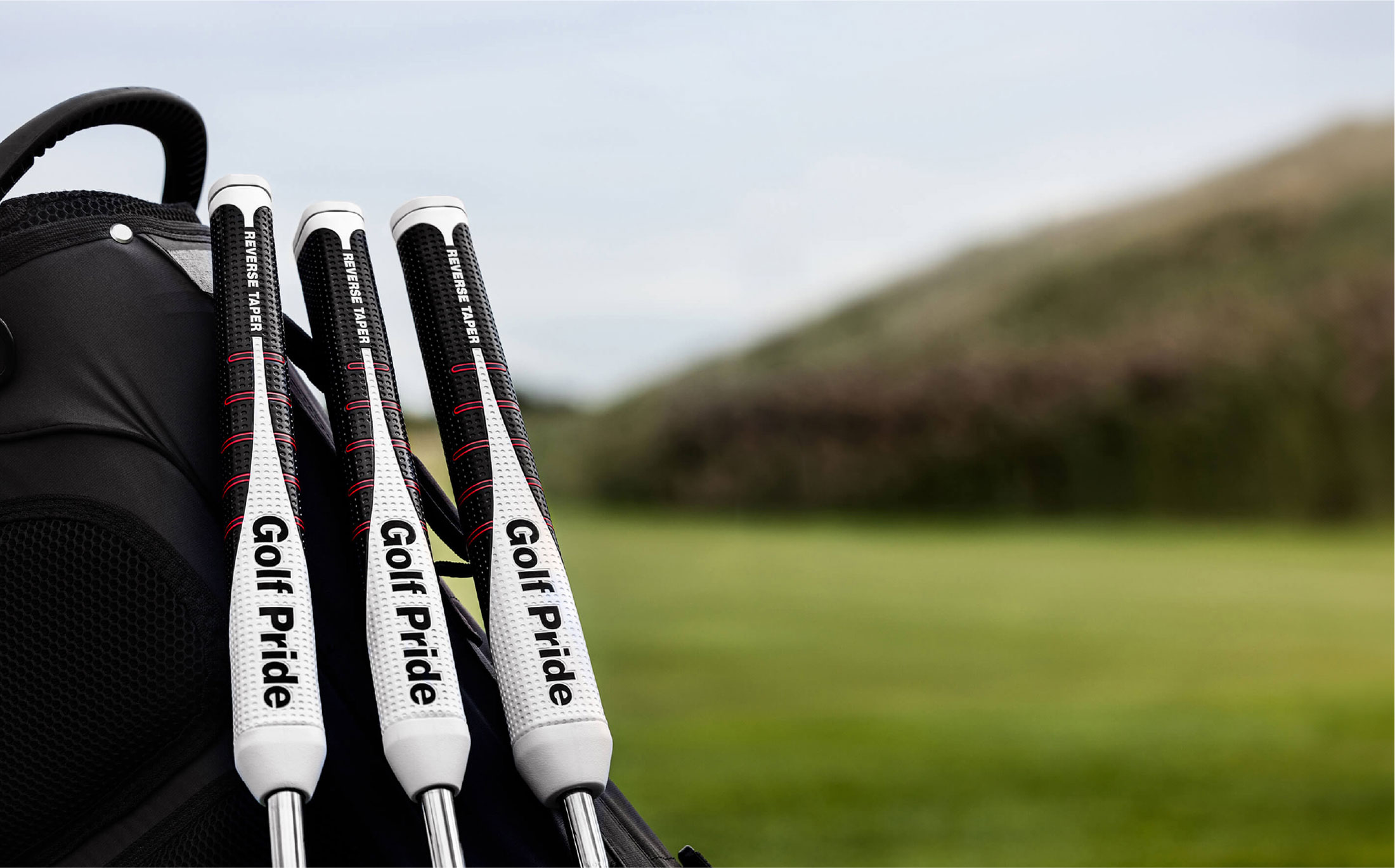
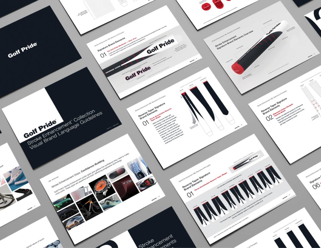
Then there is the Golf Pride Reverse Taper Putter Grip. BOLTGROUP helped Golf Pride build a complete Visual Brand Language for their Innovation Series—a unified system of form, color, material, and brand communication that made the Reverse Taper impossible to miss and easy to trust. Within three days of launch, it was the number one putter grip at a major global retailer. It went on to become the fastest-selling putter grip in the game.
That is what a Visual Brand Language does. It turns a product into a market signal.
“It was a non-trivial design project to try to figure out how to get that to come to life in a simple and powerful way, and you guys helped us nail it.”
— James Ledford, President, Golf Pride
What Visual Brand Language Actually Is
A Visual Brand Language (VBL) is the design framework that governs how your brand expresses itself through physical products. It is the system that makes a BMW recognizable whether it rolled off the line in 1995 or 2024. It operates across form, material, color, texture, and sensory detail. Applied consistently, it creates a product family that delivers on the brand promise every time a customer picks something up, puts it in a cart, or sees it on a shelf.
A VBL is not your logo, your color palette, or your brand guidelines. Those are inputs. A Visual Brand Language is the system that translates all of them into three-dimensional products and keeps them coherent as your line grows.
| A brand guideline tells your team what colors to use on a brochure. A Visual Brand Language tells your designers, engineers, and manufacturers how the brand should feel in someone’s hand. |
The Platform Effect
When BOLTGROUP built the VBL for Golf Pride’s Innovation Series, the goal was a system — a design language that could carry the brand forward as new products were developed. The VBL became the foundation for the next product in the series, the Zero Taper, to launch with immediate recognition and retail coherence. Golf Pride did not have to rebuild their visual story from scratch. They already had one.
The first product earns the shelf. The second inherits the equity. The third deepens the category authority. Over time, the brand becomes recognizable not because of advertising spend, but because the products themselves do the communicating.
If you are a manufacturer with a growing product portfolio and an ambition to own a category rather than participate in it—a Visual Brand Language is a business strategy. Golf Pride was already the number one brand in golf grips when they came to BOLTGROUP. They understood that winning today is not the same as winning tomorrow. Three days after launch, the market agreed.
NEXT IN THE SERIES
Chapter 2: Why Your Brand Looks Different on Every Product
If you recognized your own product line in anything you read here, Chapter 2 is where we diagnose exactly why it happens, and what it costs to leave it unaddressed.