March 7th, 2017
Design Tips for a Fresh, Effective Visual Identity
When I’m having my morning cup of coffee, I love to peruse the UnderConsideration / BrandNew blog. It reviews identity work of notable brands, services, and organizations. Most of the logos featured are well-executed; however, there are some misses. Occasionally, the finished products leave me aghast and I think to myself, “Seriously, why fix something that wasn’t broken?” Other designers’ comments are not favorable either. Design is subjective, yet there are ways to avoid falling in the redesign failure category.
In a previous blog, I offered examples of companies that assessed their brand foundation to create relevant visual experiences that appeal to today’s market. If you’ve thought about it and decided it’s time to reinvigorate your visual identity, try these tips.
Before you begin, reaffirm your brand purpose so your efforts translate into a truthful market positioning, a believable personality, and meaningful value propositions.
Ask yourself two questions:
- “Will the customer understand who we are simply by looking at our logo?”
- “If the logo has been refreshed, is the end result actually an improvement?”
To help answer these questions, read our blog on Purpose and Truth, and our approach to refreshing your brand. Once you have your purpose and brand story set, it’s time to explore some design fundamentals to create a successful and effective visual identity.
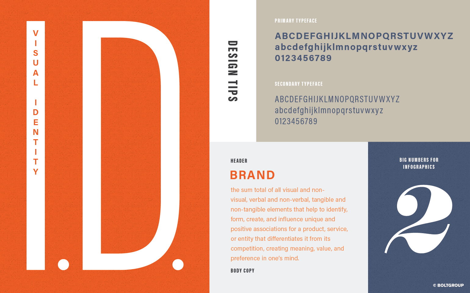
Type Talks
Whether you’re positioning yourself as a luxe fashion house or an innovative manufacturing company, typography is one of the most effective ways to communicate your brand personality. A typographical switch can help elevate your visual identity and reach target audiences you never thought possible.
A good example is Bridgestone’s logo refresh. Their brand strategy is to be more global yet still convey strength. They opted for a streamlined typeface and kept the red triangle on the letter “B.” Yes, the change is subtle, but their new logo reflects what they’re trying to achieve. Other examples include Theory, Aetna, and NOLS.
When selecting typeface(s), think of it as purchasing staples for your wardrobe: it has to be classic, neutral, and can be dressed up or down depending on accessories. I select font families that offer multiple weights that can be used for several applications. I determine which cuts work best to establish hierarchy and mood. Plus, this approach keeps your designs looking fresh and innovative.
Color Communicates
You may decide to evaluate your color palette as well. There are so many articles about color psychology and how certain hues and colors help define tone and personality. Consider the University of Nebraska’s Medical Center and Airbnb’s color palettes.
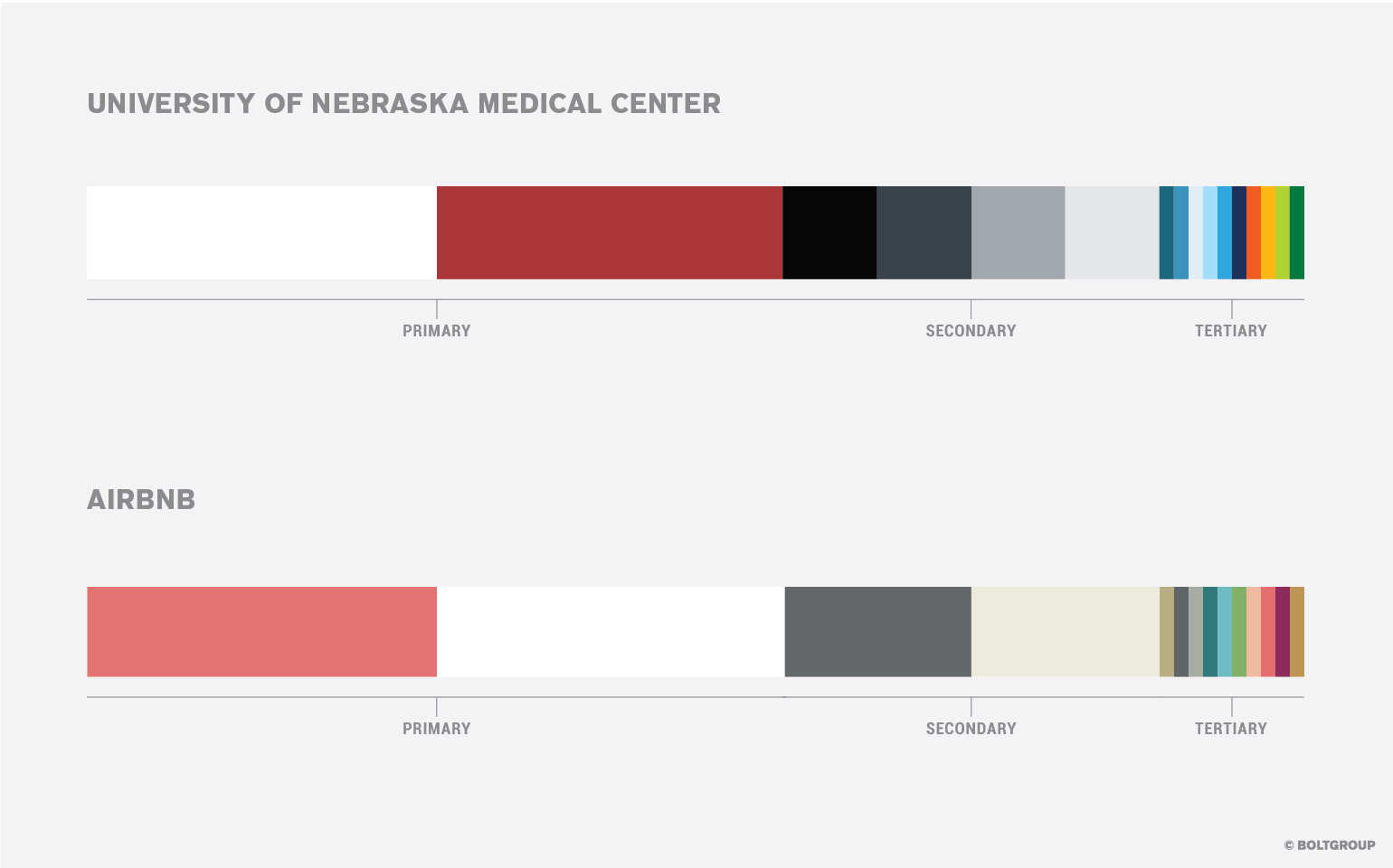
They’re almost identical palettes; however, UNMC’s colors are vibrant and energetic. This helps validate them as forward thinkers in the medical research field. Airbnb, a marketplace for short-term lodging, favored muted colors. Those warmer hues convey a sense of comfort and memorable experiences.
As with your typography, your color choices should establish a visual hierarchy and harmony. Assign grays and creams as secondary colors to complement your primary brand colors. Tertiary colors should be used judicially as accents.
And there you have it. With these pointers in mind, your design team is well on its way to creating a visual identity that not only looks good, but also authentically tells your story.