Our lives are undergoing a transformation: an evolution of how we work, learn and communicate. As we search for meaning, there’s an emphasis on taking care of our mind, body, and spirit. We find ourselves pining for the good old days, choosing inspiration in ‘retro’ colors, textures, and patterns…but with a new technological edginess. This varies by region and culture, but you can be sure we are undergoing a global shift, and color plays a part in it.
As a color designer, I continually look for solutions that respond to lifestyle trends. Especially those that address emotional, cultural, and demographic preferences. COVID-19 has had a significant impact on the trajectory of color, material, and finish (CMF). As lifestyle trends ebb and flow, inflection points and opportunities to engage bob to the surface. Although COVID-19 is a massive example, trends are always there to guide you, if you do the research. All current and cultural events shape consumer preferences: high fashion, the Olympics, politics, the environment, and any new and notable experience. Long-lasting macro trends foreshadow the future of color. Micro-trends guide seasonal and brief lifecycle product CMF.
Few elements can translate lifestyle trends like color. It speaks and resonates. From a brand perspective, color can give voice to your purpose, vision, and mission. What do you want your brand and product colors to personify? What colors represent the core values [pillars] of your brand? Color helps personify these traits. Consider the lasting messages colors can send about your product and your brand. Take this time to reflect on how and what you communicate through color. Translate world events into color, material, finish, and patterns that support your customers’ needs and your brand message.
Imagine communicating a manifesto about your brand and product with a single glance. It is possible with a strong Visual Brand Language—a set of visual elements used to communicate your brand messages and product attributes. Your Visual Brand Language must acknowledge, yet transcend trends. And it begins with color! The alphabet that makes up this language is comprised of visual elements, including color, form, texture, material, pattern, and typography. How the letters of this alphabet are assembled and applied will form your bespoke brand language. Visual Brand Language creates an emotional tie between your consumer and your brand. (More about creating a Visual Brand Language.)
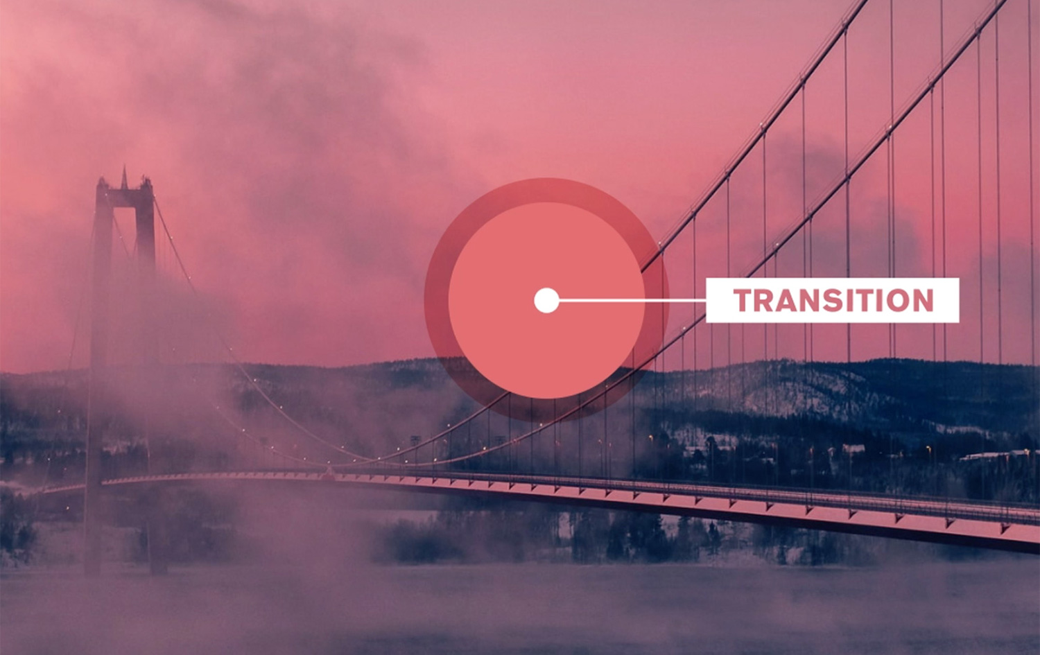
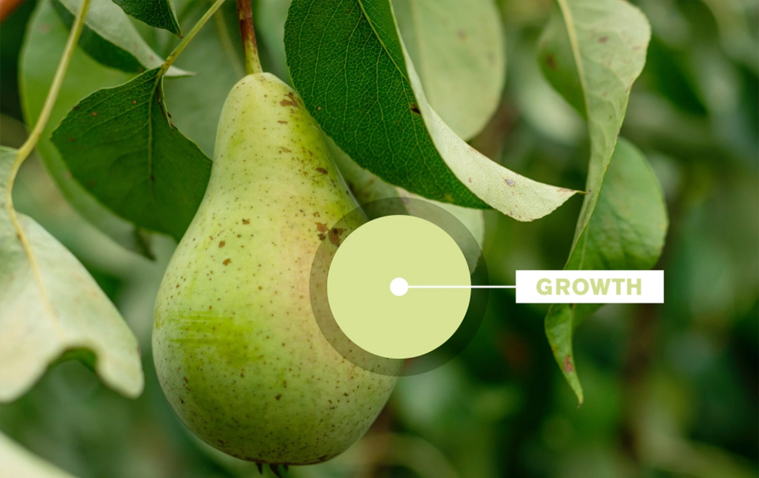
Our current climate is testing and reshaping habits. Redefining what we see as essential. Align (or realign) your color strategy with your Visual Brand Language and product introductions. Make sure they jibe with consumer needs and desires. Only then can you leverage your brand’s visual identity through CMF. Research and translate trends. Design and brand for the well-being consumers seek. As you do, you’re almost sure to discover two anchoring colors: “Transition” and “Growth.”
As we adapt to our new way of life, there are no road signs or how-to manuals. We are all in between hope and fear, home and home office, past, and future. Transition is a hopeful color that bridges the gap between red and orange. This color stands between the states of natural and synthetic, bold and soft, he and she, darkness and dawn. The subtly faded quality of this color pays homage to the retro trend. The synthetic edginess speaks to technology and our future.
Transition color notation: sRGB 221,98,101. Link to Instagram animation.