September 21st, 2016
Actors, Architects, and Lessons in the Customer Experience
In 1978 Heinz Ketchup created a spin marketing campaign. The fact that their thick ketchup took so long to pour from the bottle was repositioned as a plus, and they used the Carly Simon song “Anticipation” to make the point. The problem was, the customer experience never quite matched the advertising. Yes, we anticipated it alright … sometimes waiting for minutes, shaking the bottle, poking it with a knife, slapping it in just the right spot.…until it finally gushed out, covering the plate. The product experience was a negative.
Twenty years later Heinz got smart. Rather than spin a negative experience as a positive they decided to design a new experience. Their squeezable-plastic-upside-down-bottle affords ketchup lovers the great experience they crave. The ketchup is always right at the opening, it comes out faster, and the pin in the lid keeps the dried ketchup crust from building up. For the user it closed a gap in the positive experience with the Heinz product and brand. For Heinz the plastic bottle led to increased ketchup sales.
Today, when we think of designing the user experience, it’s often focused on the interactions people have with a digital screen. The design of screen graphics, navigations, buttons, and gestures form the experiences that get keen attention. That’s not a bad thing, but it’s only part of the experience. The total experience involves a much broader environment.
Like an architectural environment, our experience with a product is the summary of each touchpoint, each stop along the journey with a product. The aesthetic, kinesthetic, tactile, intellectual, and emotional components of the experience all play a role. What’s more, our experience is driven not only by the product, but also by our motivations and emotions, and by the brand we perceive surrounding the product.
In truth, we can’t exactly design experiences. Only people can bring the emotions, memories and perceptual skills needed to activate human experience. But we can design the catalyst for experience and the opportunity to make the experience wonderful.
As a product designer working in both the digital and physical realms, I like to look at other professions for ideas on how to create the catalyst for positive experiences.
3 Ideas to Create the Catalyst for Positive Experiences
1. Product Design as Method Acting
What’s My Motivation?
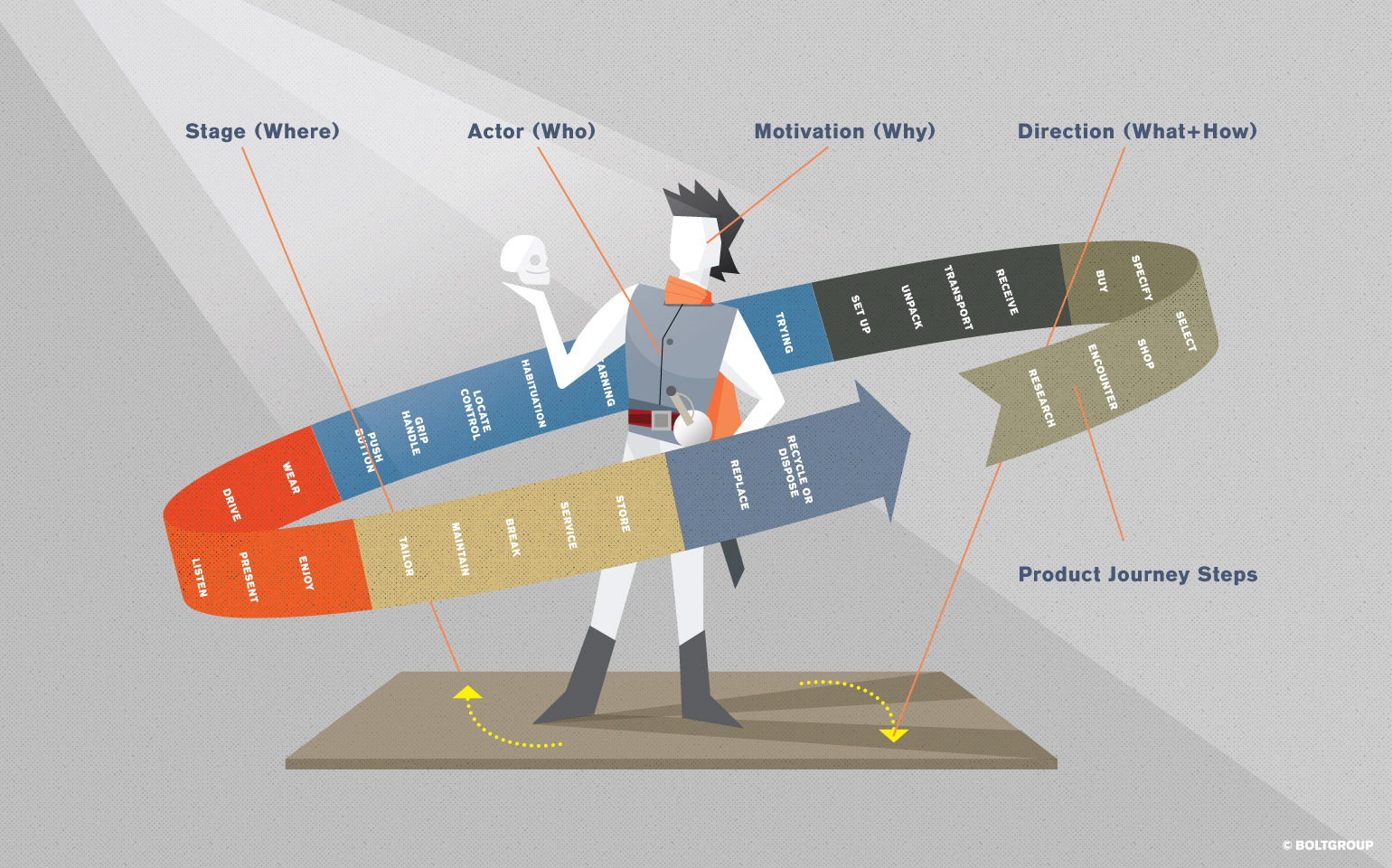
A deep dive into the Who, What, How, Where, and Why of people’s interactions with a product leads to a better understanding of the total experience. By dissecting each of these facets we see the impacts they have. And by looking at them through the lens of an actor we can get at the essence of “Why.”
Who
First ask Who will activate this experience. In business we often call them users, consumers, or customers. But really they’re people, guests, or audience members. What do they bring to the table? What do we know about their needs, desires, attitudes, emotions, capabilities, and preferences?
Since we started our design business in the 1980s, we have dedicated the first phase of each project to gaining empathy with the people who’ll use the things we design. We’ve written extensively on ways to gain that empathy (see more at this article).
What
What is the activity people wish to accomplish? Cleaning the floor, making a phone call, blending a breakfast smoothie. The What helps determine the prioritization of features and steps in the physical and digital interaction with a product.
How
Through the How we accomplish the What. The How defines the series of operational and sensory interactions that take place between the person and the object. Things like pushing the buttons, pulling the handle, navigating the menu, or swiping the screen.
Where
The Where is the environment in which the experience with a product takes place. While some products are site-specific (a doorknob, a glove box) and others live in a variety of environments, the environment of use impacts all product experiences.
Product design often stops here. The Who / What / How / Where often makes up the “problem-solution” in a design project. But this ignores the essential Why.
Why
If the user experience were a performance, the Who is the character, the What is the action, the How is the script, and the Where is the scene … then the Why is the motivation—hugely important! Method actors like Marlon Brando and Dustin Hoffman looked for the underlying motivations of their characters to channel authentic emotions. They wanted not to “act” but to react to the situation with true feelings.
Product designers can uncover insights that lead to positive experiences by looking at motivations—the needs, emotions, and feelings that drive a person to interact with a product. I use a vacuum not just to get dirt off the floor, but to impress someone, to feel better about myself, or to feel like I’m keeping my family healthy. We make a phone call to connect, share, learn, or vent. We come to our morning smoothie blender worried about the day ahead, feeling like we need a healthier diet, but too rushed to cook something more.
Examining the characters in the performance, their actions within the scene, and most importantly, their motivations, provides designers with guidance towards better experiences.
2. Product Design as Architecture of an Immersive Environment
Creating the Journey
Early in my career I designed experiential environments, like hands-on science museums and corporate showrooms. We created places where people combined learning and play to have delightful, enriching experiences. Our design touched every facet of the experience: the aesthetics of the architectural spaces, the sounds and lights guiding people through, the structure and graphics of hands-on exhibits, and the naming and branding of the business.
Our design process included a “visitor experience map”—a diagram showing every encounter the visitor might have with the museum and its exhibits. The map was a series of concentric rings. At its core was the sequence of interior spaces and exhibits. The next ring was the museum exterior including arrival, parking, and approach. And finally, an outer layer showed the museum’s brand and public communications (back then we called it the “identity”).
Nowadays this diagram of experiences might be called a Journey Map. Using a journey map in product design, like my experience map through an immersive environment, can give product designers food for thought as they create more encompassing experiences.
The Journey Map—Diagramming Interactions
Unlike my experience map, journey maps today are usually focused on navigation through a website or a building. But the same customer journey holds true for the total experience of a product.
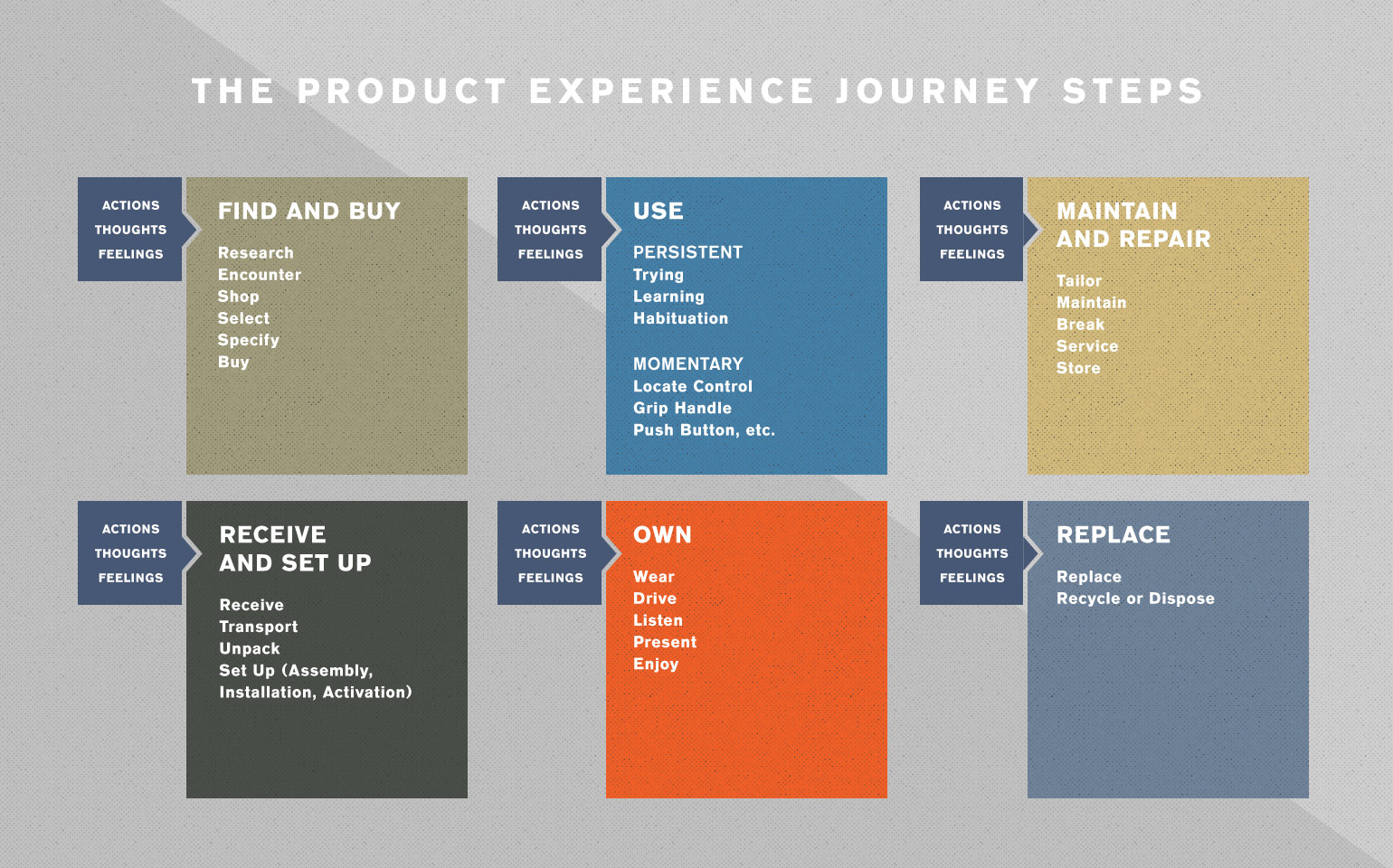
A journey through the life of a product is a series of stopping points with transitions between. As product designers we study each point—every environment of use, every moment, every touchpoint. We seek to understand the user’s objective behavior and their underlying motivations.
For each interaction we consider the user’s Actions, Thinking, and Feelings. Actions can be observed through research. Thinking and feelings can be inferred or sometimes learned through interviews. We also consider the journey through the purchase process so we can build visual cues into the product design that communicate the right messages at the point of sale.
A typical product journey might look like this….
Transitions—The Spaces In-Between
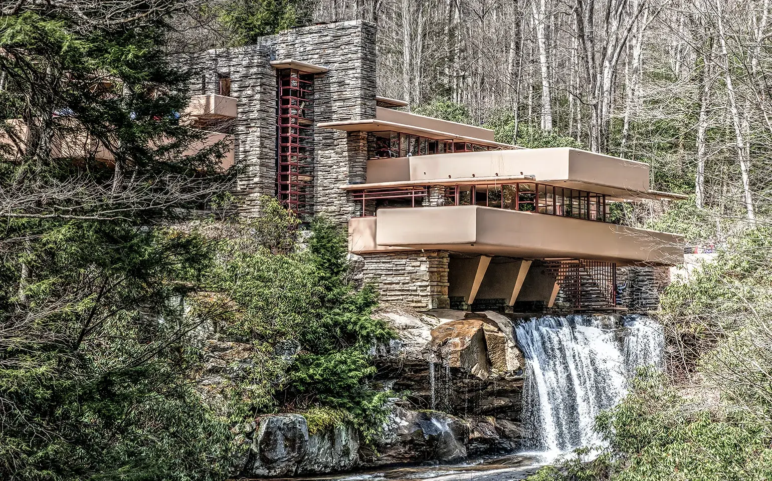
Architects create transitions between exterior and interior, between public and private, and between rooms with different functions. Frank Lloyd Wright was a master at converging inside and outside with transitions like textured walls that extended from inside to out, bands of windows, projecting eaves, and terraces. Transitional spaces create hierarchy and coax visitors along the journey. They heighten people’s senses, making us eager about what’s to come and helping us remember what we’ve been through.
Product design experiences have similar transitions. Transitions are the connections between stopping points along the journey through the purchase, use, and maintenance of a product. As designers we study these transitions to inspire more rewarding experiences.
When I transition from hardwood floor mode to carpet mode on my vacuum cleaner, are there appealing visual cues to guide me through the transition? Can I do it with just one hand (since I’m holding the cord with the other hand)? Is there a visual and audible signal that I’ve made the transition (like a different vacuum sound)?
Another example is the transition from one seat height to another in an ergonomic office chair. The height I desire is the stopping point, but the transition is key to the overall experience. If the seat falls too fast, or raises too slowly, then the experience is negative. And that negative experience is logged in my brain as part of my overall experience with the chair.
Wayfinding—Where do I Connect my TV?
Transitions can be disconcerting without wayfinding. I recently visited a friend in the hospital. I followed the signs right, then left, then into a long corridor that went on forever. I feared I’d taken a wrong turn, so I turned around, walked back, turned again, walked for a while, and finally found someone to ask for directions.
It was a frustrating experience. A good wayfinding system would have included additional signs in the corridor to give me encouragement along my journey.
Product designers can learn from wayfinding too. As we design each function and feature in a product, we think of the experience as an environment that guides people through the journey. We can design sensory cues to let people know they’re on the right track, visible / audible / tactile signals that guide users along. The color, shape, and sequence of buttons on my smoothie blender. The click of levers on my vacuum.
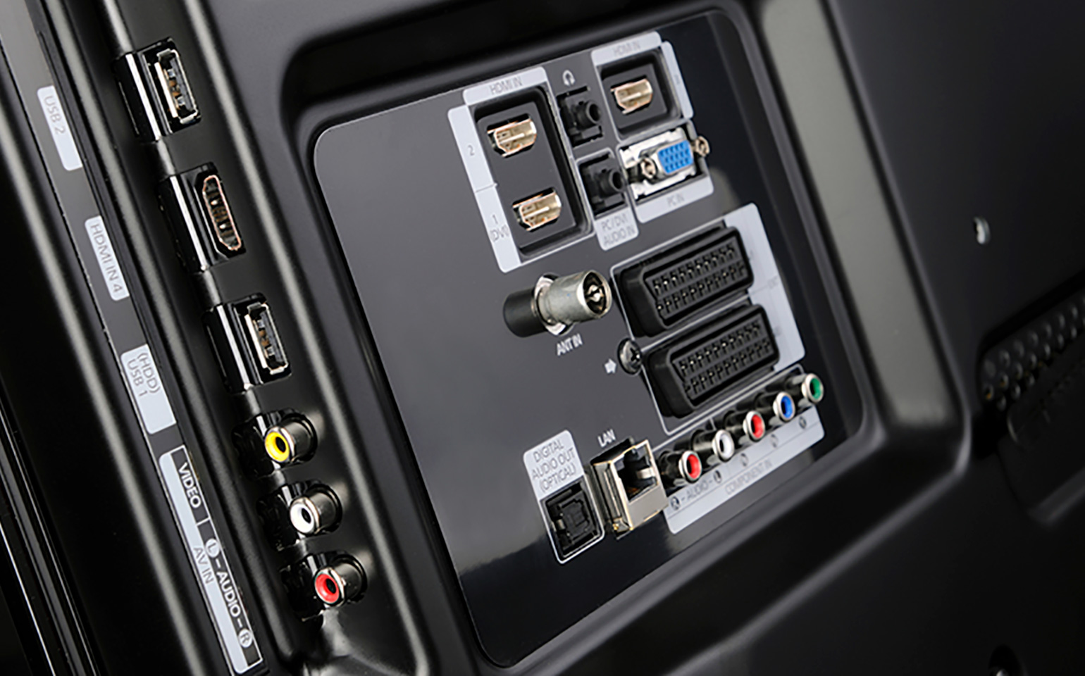
Which leads me to the frustrating layout of my new television.
With the front cabinet of TVs now essentially the same, the back is where experience design comes into play. But the back of my new TV needs wayfinding. The layout of all those HDMI and USB ports makes no visual sense. Along with the connections for power, cable, and audio, the back of the TV isn’t adapted to the way I set things up. And that’s a deal breaker for me when it comes to TV purchases (so, I’m taking it back!).
Materiality—The Atoms That Surround the Bits
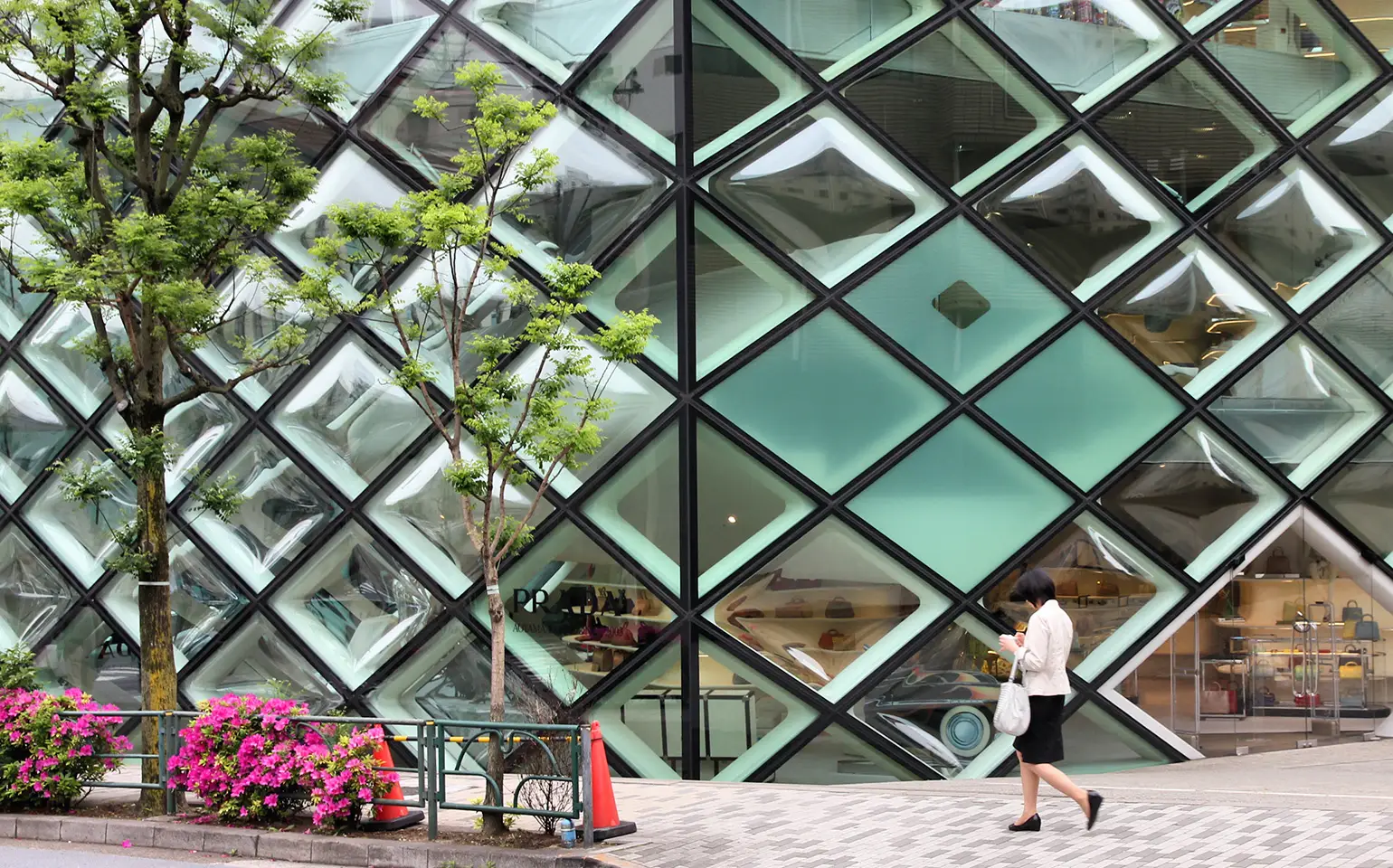
Satin metal juxtaposed with translucent plastic, patterned fabric coyly exposing polished wood grain. Materials imbue products with personality. Materials position products as compared to competitors in the mind of the consumer. Some of my favorite architects today experiment with materials to create stimulating experiences. Pritzker Prize winners like Jacques Herzog, Pierre de Meuron, and Jean Nouvel create relatively simple architectural shapes but cover the surfaces with imaginative materials. Look at the Tokyo Prada store or the Cottbus University library.
In product design, digital screens and miniaturization have driven the function of products further and further under the surface. So the surface—the material that’s left to touch, hold, and manipulate—is now more crucial than ever. And consumers expect perfection. Apple’s designers invested untold hours massaging the materials, finishes, and minute details of the jewel-like surfaces on the iPod and iPhone.
Delight—Pleasant Surprises Along the Journey
Have you ever turned the corner into a courtyard and felt the sheer delight of an unexpected beautiful space? Participants in the product journey are delighted by pleasant little surprises too. The clever pocket in a new jacket, the ease with which the power drill battery snaps into place, the funny reminders my mobile app provides, or my car’s dome light switch that’s in just the right place for my reach.
Pleasant surprises along the product journey delight participants and keep them coming back. Mobile app and game designers know that variable rewards keep users coming back. Like a slot machine, if we receive rewards that vary over time, but don’t know exactly when the reward will come, we tend to come back again and again.
3. Product Design as Brand Expression
Articulating Brand Attributes
In the 1990s I described in the Design Management Journal how consumers experience products and their brands as one mental construct. Through what I called intra-sensory perception, people comprehend all the moments of engagement with a product + brand experience. From the product’s sensual aesthetic to the meaning behind its name, from the voice of the service technician on the phone during set up to the box in which it came. The total experience of our product + brand journey is the combination of every encounter we have along the way.
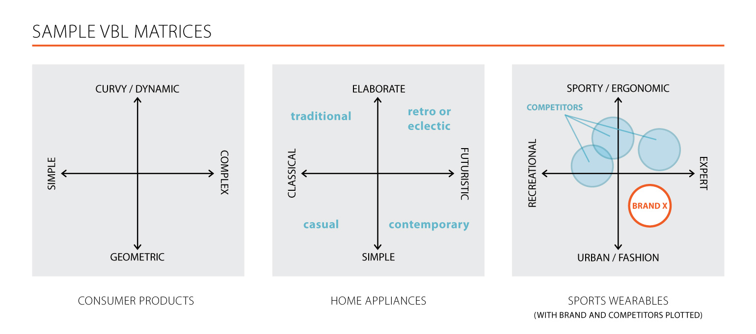
Today we call this the “brand ecosystem” (for more about this see our article about brand ecosystem). Product designers can use brands as both a catalyst and a guide for creating more enriching experiences. Brand attributes can be articulated through product design. Products can be imbued with brand stories creating meaning and histories that people find enriching. Disparate product families can be reconciled through Visual Brand Language (for more about VBL, check out this article).
The most powerful connection a company can make with its product audience is an orchestrated symphony of experiences, weaving together the interactions people have with the product, and leveraging the emotional and physical responses those experiences create. Done well, experiences like these will inspire preference, praise, and loyalty in your product and your brand.