June 27th, 2017
Let the Power of Color Speak for Your Brand
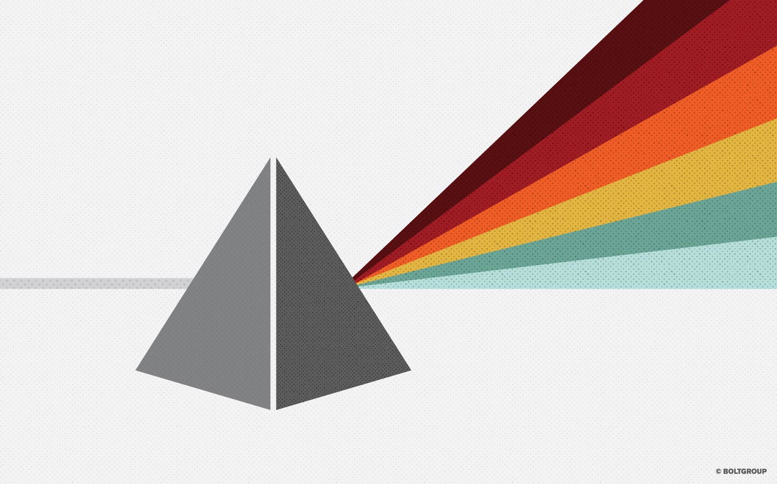
Color. It’s often the first interaction we have with a brand, perhaps even subconsciously. Our brain processes visual information before anything else, and the color spectrum is at the forefront of the stream finding its way into our hearts and minds. Color has always been a powerful communicator, one that speaks without words. We see it. We experience it. We live it. It affects our mood. Our taste. Our lifestyle. Our choices. Color can establish trust, create comfort, incite anger, or instill fear. Wow! Do you feel it?
With great power, comes great responsibility. It’s a familiar phrase that can pertain directly to color. That’s why color should be considered a vital instrument in your brand’s tool chest. When it comes to selecting your brand’s color palette, think beyond the subjective. Reference the pillars, positioning, and even personality of your brand. How do you effectively communicate those truths out into the marketplace?
We know that all colors have meaning. It’s no mistake that you see like colors being used in similar economic applications. Brands in the food and beverage industry often sway more towards colors that create excitement and hunger—reds and yellows. Brands that have a strong foundation in supporting and nurturing the environment, or ones that sell natural, health conscious products usually gravitate toward earth tones—greens, blues, and browns. And brands in the medical, financial, and home living industries often try to evoke a feeling of security and professionalism—blues, purples, and grays.
But these aren’t set rules. Sometimes even breaking out of the norm is a way to express innovation and passion.
When we partnered with Archroma Color Management, one of our main challenges was to update their brand for a new audience, and create the visual identity for their newest color specification tool—the Color Atlas by Archroma. How do you narrow in on one or two colors to represent a product that sells all colors?
Our solution—create an organic identity for the product itself. With the brand sitting comfortable with a cool, approachable blue, we allowed the Color Atlas to step forward with the ability to assume practically any color. When you’re appealing to designers on a global scale, a flexible identity is valuable for targeting to any audience. (See the full case study here.)
However, there are times when a more direct approach is required.
In the early 90s, Black & Decker made a major move to elevate their DeWalt brand in the professional user space, and chose to do so with a bright yellow color scheme. The idea was to separate entirely from the parent brand. Knowing that Black & Decker sold home appliances, a lot of contractors and builders refused to use the brand on jobsites. However, the yellow was a bold move. With a nod to safety and a bright product line, the DeWalt brand color stood out when their trucks rolled up on jobsites to promote the product. The rest is history.
At BOLTGROUP, we chose orange as the ultimate expression of our brand. Orange is a color that sparks creativity, and evokes enthusiasm and playfulness, yet stands with confidence. Our purpose lies in those moments in life that spark meaning. We live for these moments that inspire us to design compelling solutions. The color orange had to be just right—not too weak or pale to go unnoticed, but not too red to be over the top. It had to be inspiring, and speak to us each morning as we walked through the door. It fuels our inspiration, our passion, and our creativity, providing us the momentum to create those same moments for your brand.
Color is anything but random. It’s not just a secondary tool to be taken lightly. Consider your brand’s foundation, your audience, and your message. Then select a palette that speaks volumes for your brand, without saying a word.