 ;
; Scepter
Transforming the King of Containers: A Scepter Brand Refresh
How many of us can tell one red gas container from another? We helped create a smarter, trusted, and best-in-class transformation, with a new focus on the doers of the world.What We Did
Brand Strategy
Brand Architecture
Brand Naming Strategy
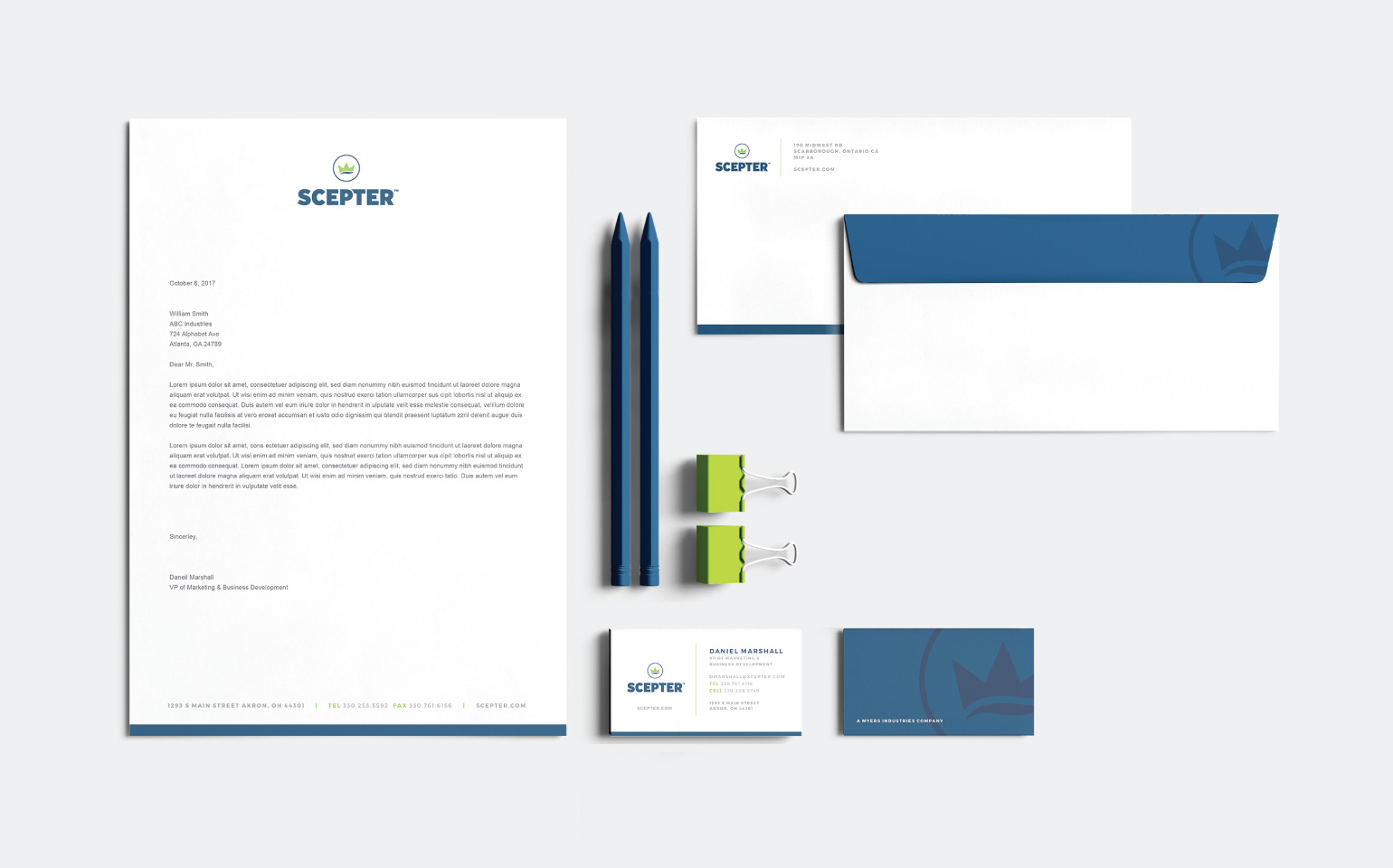
Visual Identity System
Experience Design
Brand Design Systems
Brand Communications Strategy
Color Specification
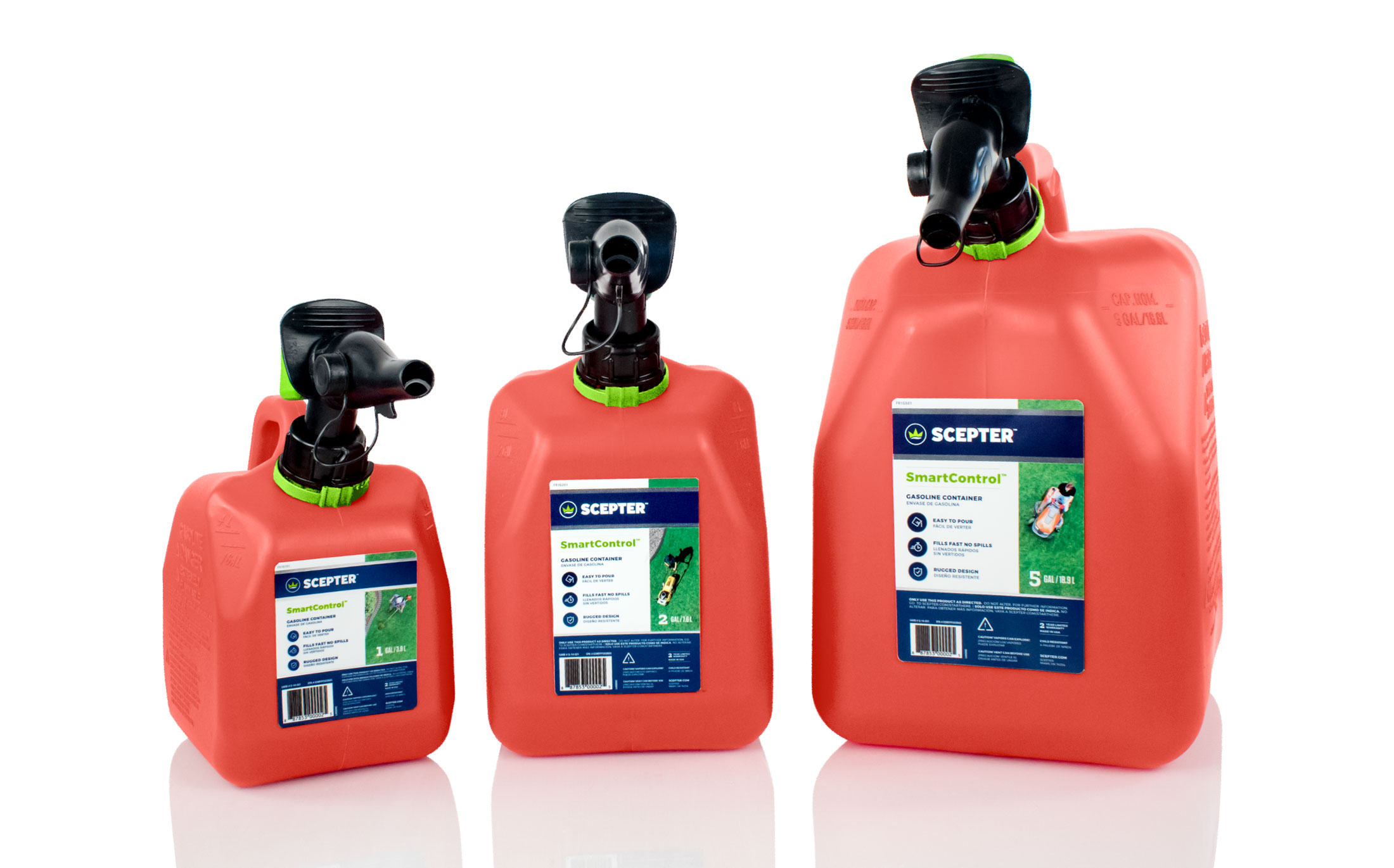
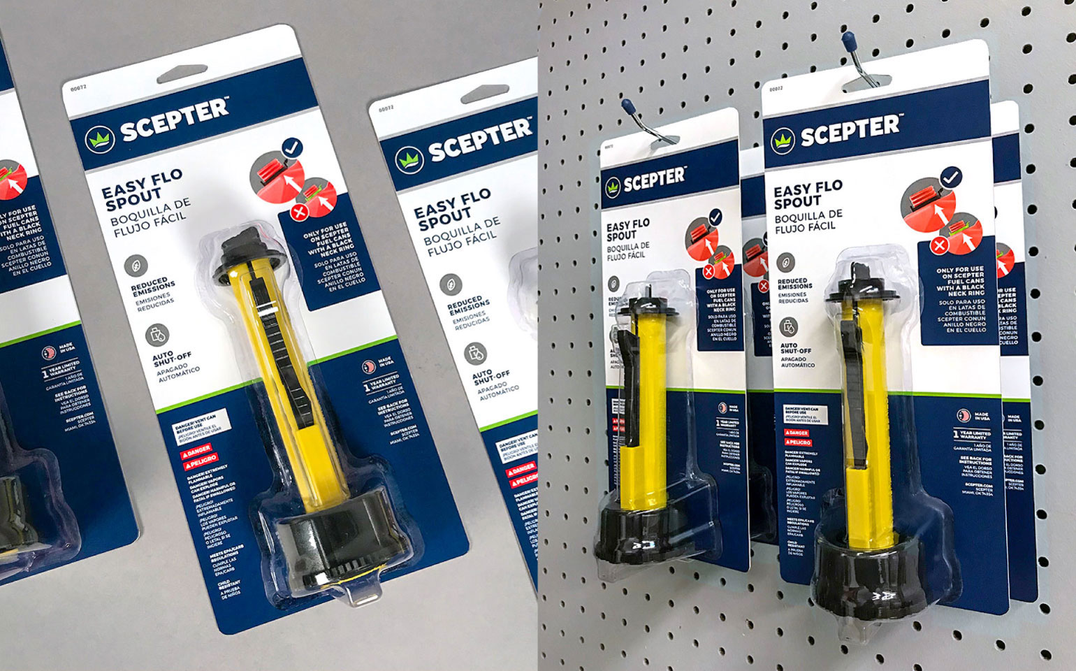
Retail Packaging Design
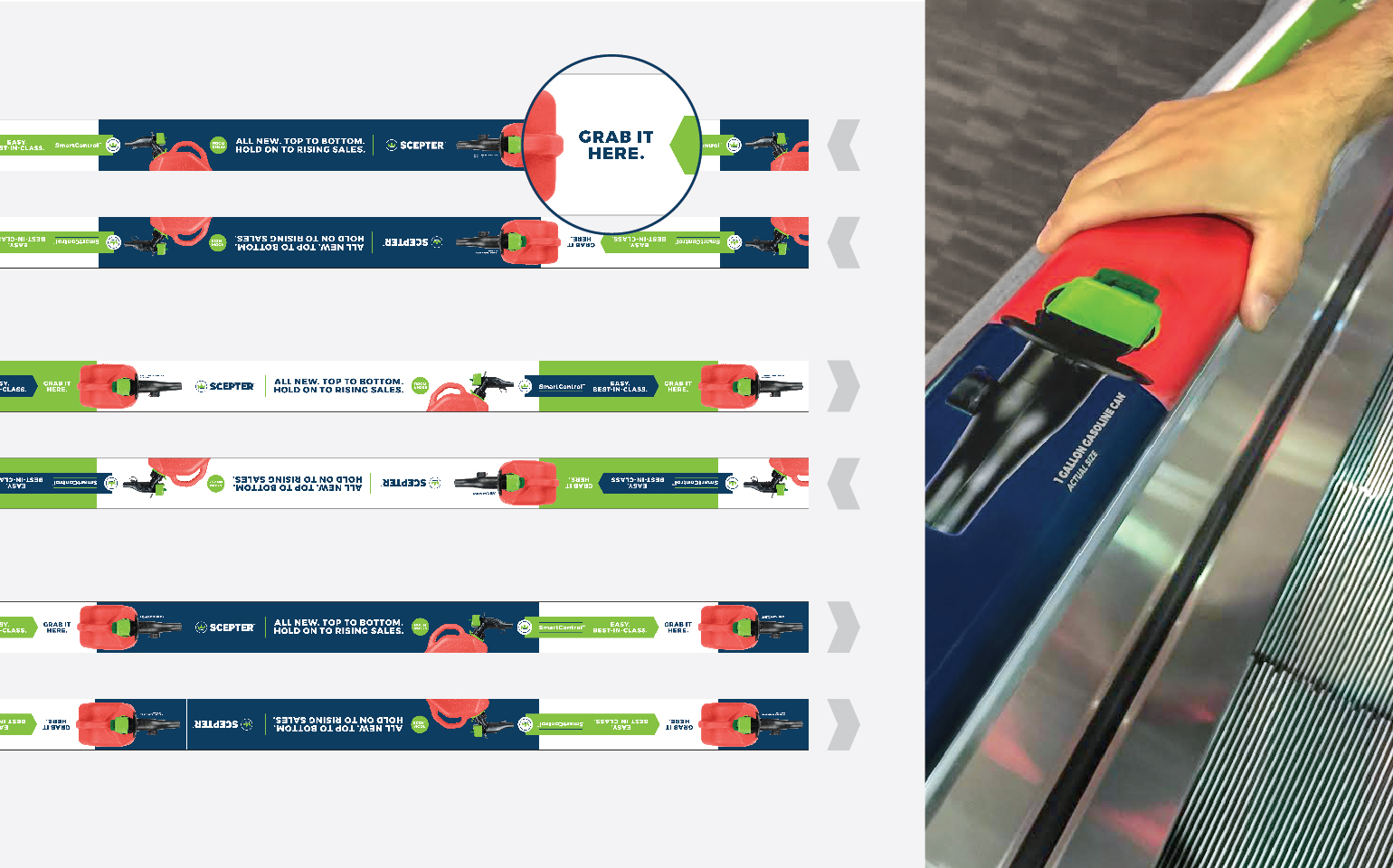
Visual Retail Merchandising
Trade Show Booth Design
Direct Mail Strategy
Promotional Design
Creative Art Direction
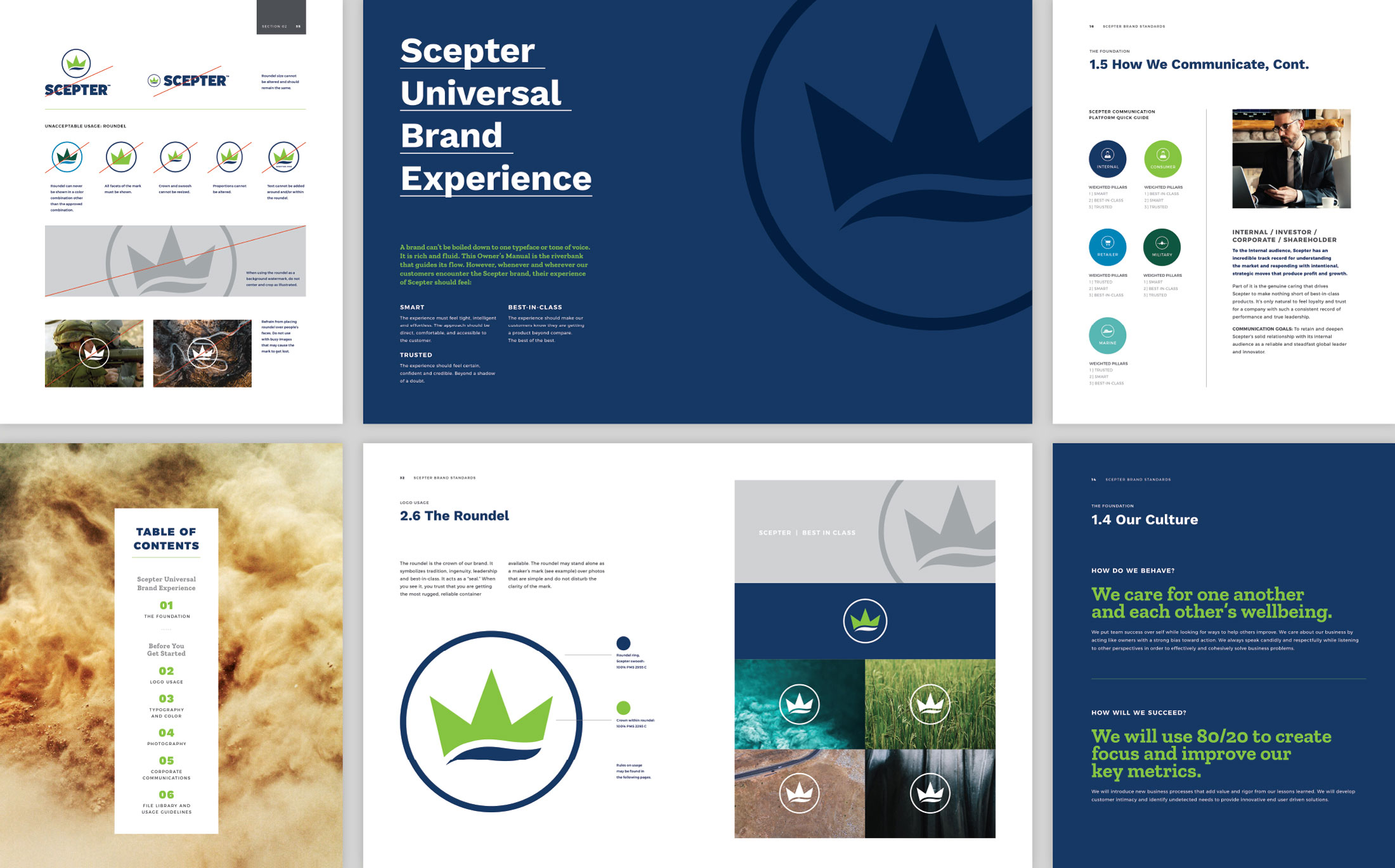
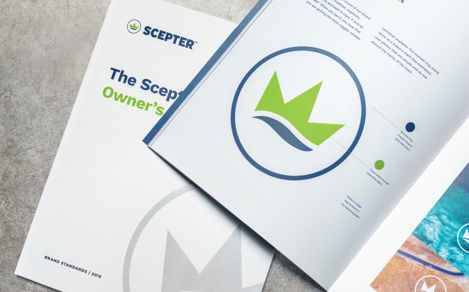
Brand Guidelines
Graphic Signage Design
Brand Coaching + Training
Fabrication Coordination + Fulfillment

Challenge
What are the odds that in the first conversation with BOLTGROUP, a client says they want the work to be transformative? Pretty long. But that is just what the folks at Scepter did. This Canadian-based molded plastics company started out making household goods, and by the time they knocked on our door, they were the world leader in hazardous materials containers, better known as gas cans. But how many of us can tell one red gas container from another? Addressing that was a huge challenge. Oh, and be transformative, while you’re at it. Just the sort of project we love.
The first part of our job was to fully understand the brand situation, the industry dynamics, and to develop a transformative brand strategy. One that would not only separate Scepter from its competition, but begin to enlighten the public about what Scepter really does and for what it stands.
Solution
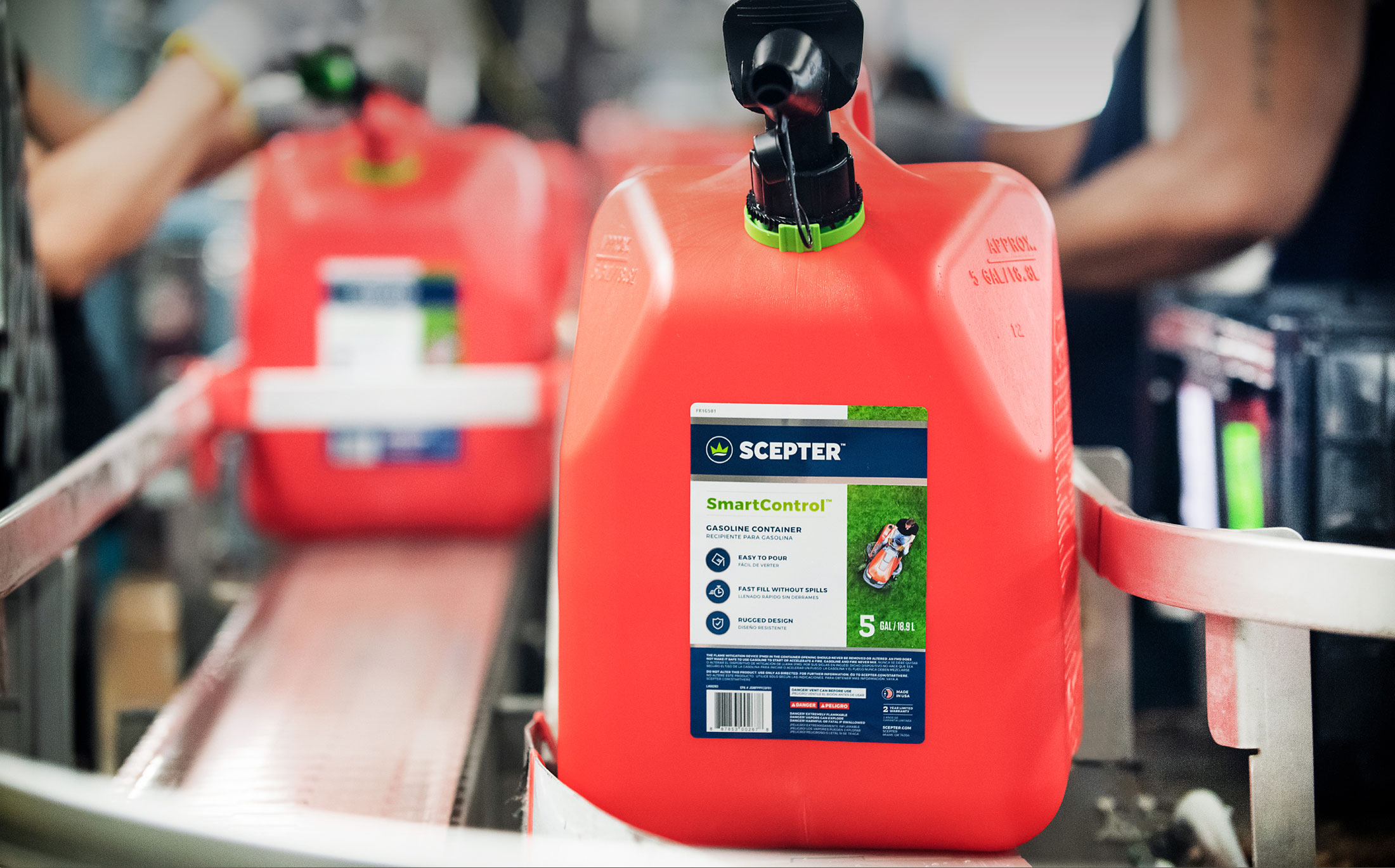
Digging in with the Scepter team, we immediately saw what made this company tick. As a legacy business, Scepter had built a reputation on being smart, trusted, and best-in-class. The company genuinely cares. About people. And about doing every job right. Scepter is set up for quick response to impending and immediate natural disaster needs. Scepter can safely transport military munitions on the battlefield in lighter, stronger cases. And in backyards around the world, Scepter provides a safer, smarter spout for lawnmower gas cans.

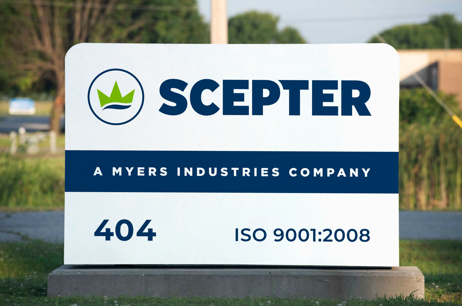
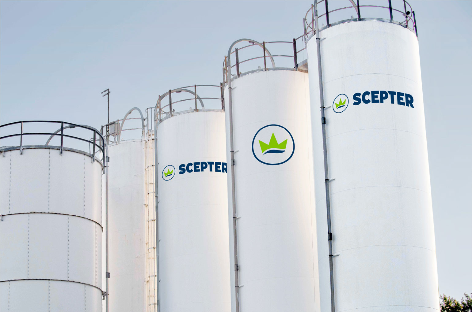
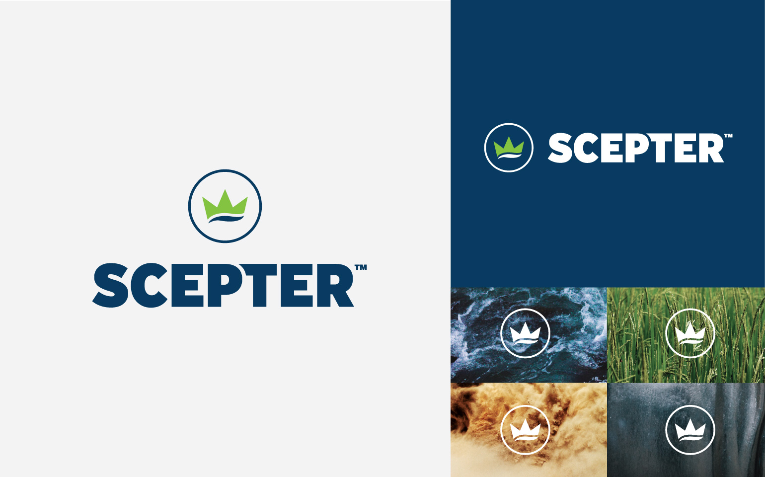
We transformed the original Scepter logotype into a smarter, current version. Honoring the mark’s lineage, but representing Scepter as the global king of containers—even designing a subtle hint that our products are used on land and at sea.

Results
- Debuted the extensive new corporate identity to thousands of retailers at AAPTA’s annual show in Las Vegas
- Secured new retail placement
- Rolled out a complete brand identity system
- Developed successful roadshow presenting new identity to employees in Canada and U.S.
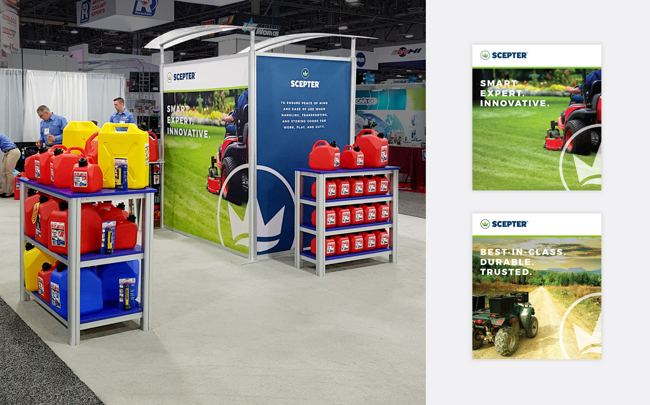
With a new focus on the doers of our world, Scepter will continue to ensure peace of mind and ease of use. And they’ll do it for every person handling, transporting, and storing goods for their work, play, and duty. When you think about it, that’s transformative for everybody.
Key Takeaways
- Built a modern visual identity that honors heritage but positions Scepter as the global king of containers.
- Shifted brand focus to “doers”, emphasizing smart, trusted solutions across work, play and duty.
- Rolled out a unified design system (packaging, signage, fleet graphics) to strengthen brand recognition and clarity.
- Brand refresh created enthusiasm internally and strengthened retailer / market response.
Thanks so much for helping us craft this new look, feel, and purpose. Couldn't have gone any better. As someone who has been with this organization for 20+ years, it was awesome to see everyone so pumped about the future of the company. Thanks again for all of your help. BOLTGROUP is simply a top class organization and we are so lucky to have found you.
— Tania Reynolds, Product Marketing Manager, Scepter, Inc.