 ;
; SEALY
Sealy Tiered Branding Packaging Design
The BOLTGROUP design team created a complete tiered branding packaging design for Sealy for a good-better-best line of top of bed accessories.What We Did
Brand Strategy
Brand Naming Strategy
Visual Identity System
Visual Brand Language
Brand Design Systems
Brand Communications Strategy
Retail Packaging Design
Visual Retail Merchandising
Fabrication Coordination + Fulfillment
Color Specification
Creative Art Direction
Brand Production
Retail Design Service
Channel Strategy
Awards
Challenge
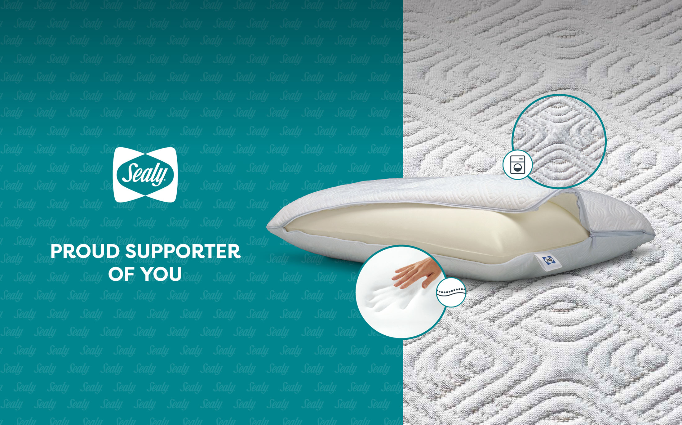
To support Sealy mattress corporation’s channel strategy for top-of-bed accessories, their licensee, Comfort Revolution, came to BOLTGROUP to create a good-better-best packaging architecture. The packaging design needed to stand out in a saturated market, hold together across multiple retailers, and be flexible enough to allow for future expansion of product. All while staying true to the newly refreshed Sealy brand standards.
Solution
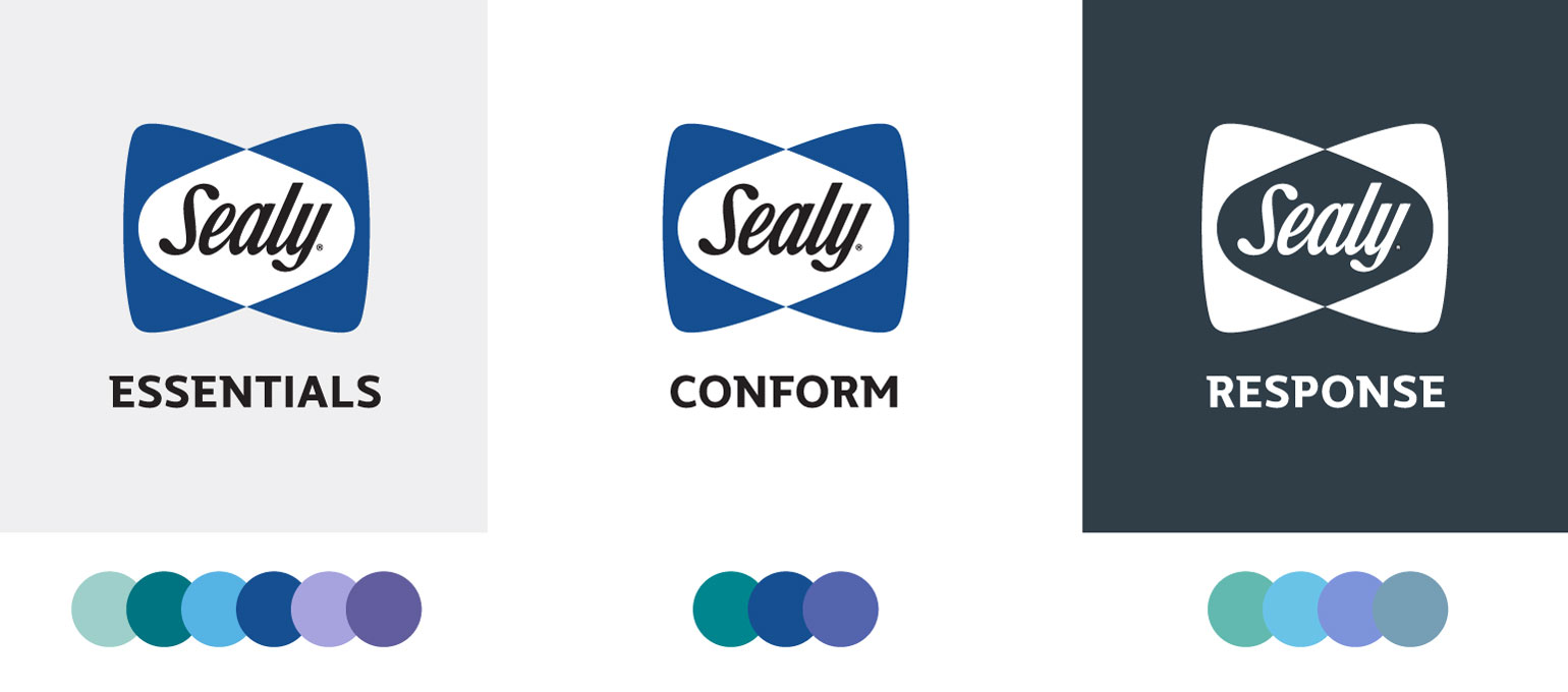
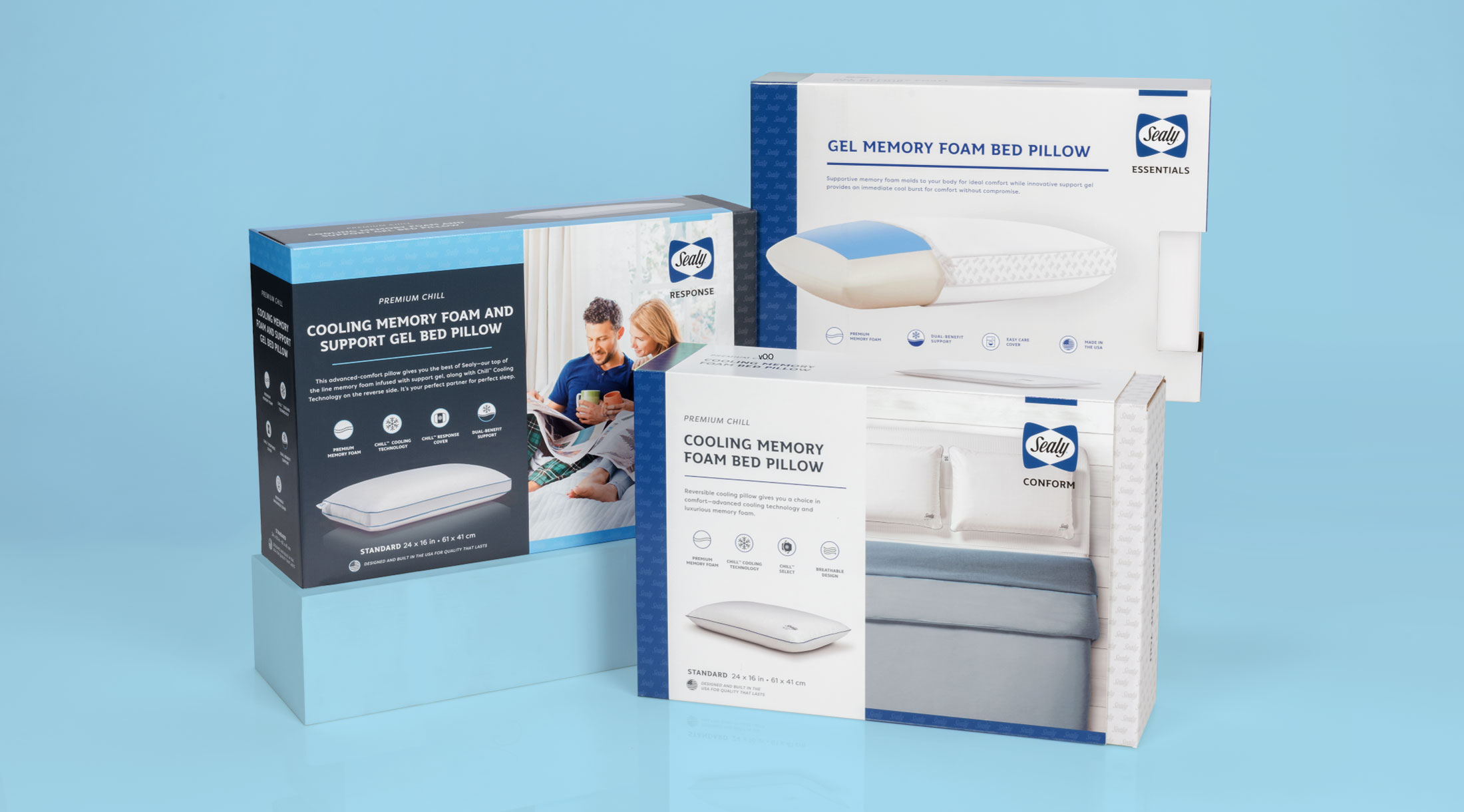
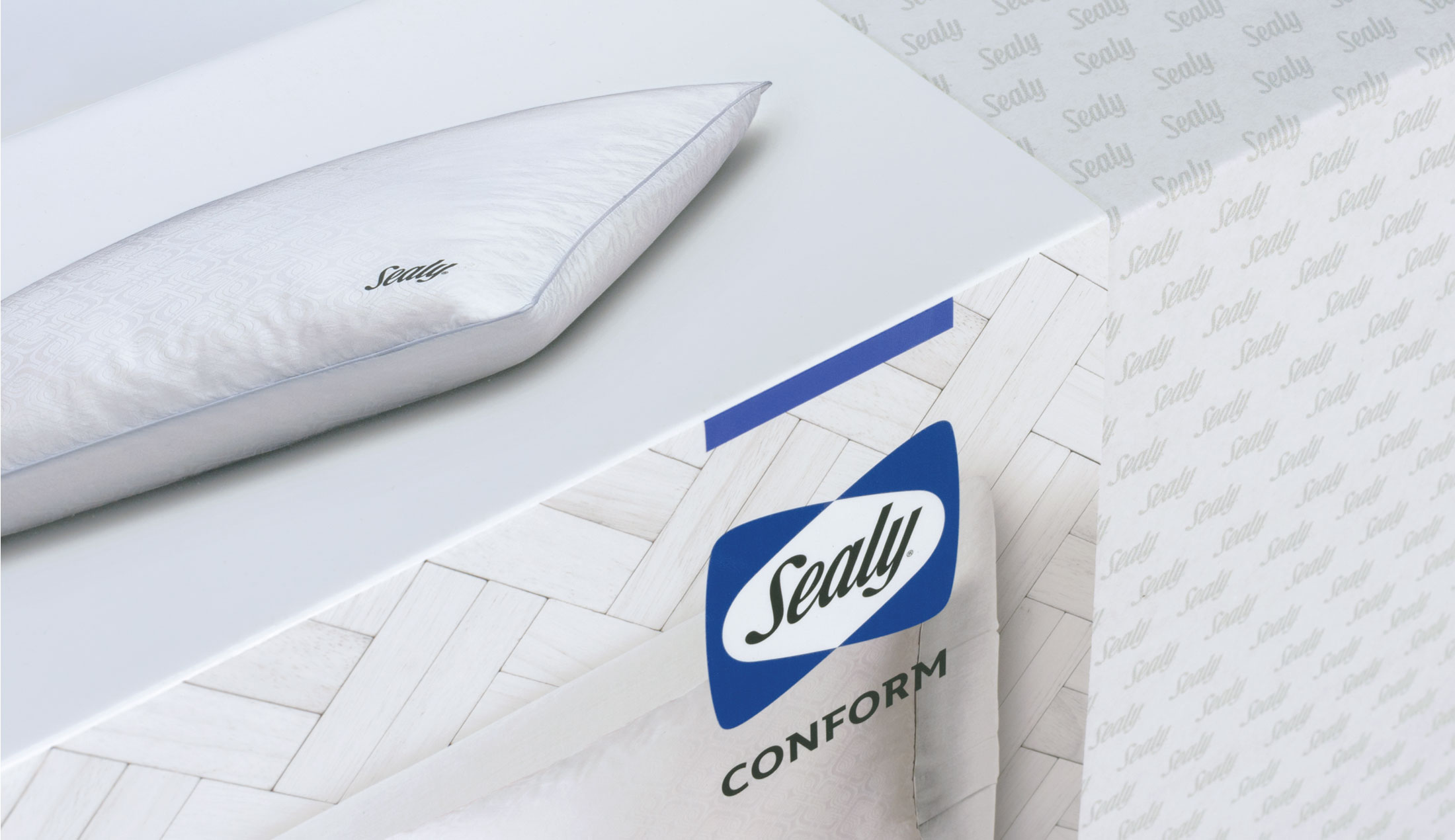
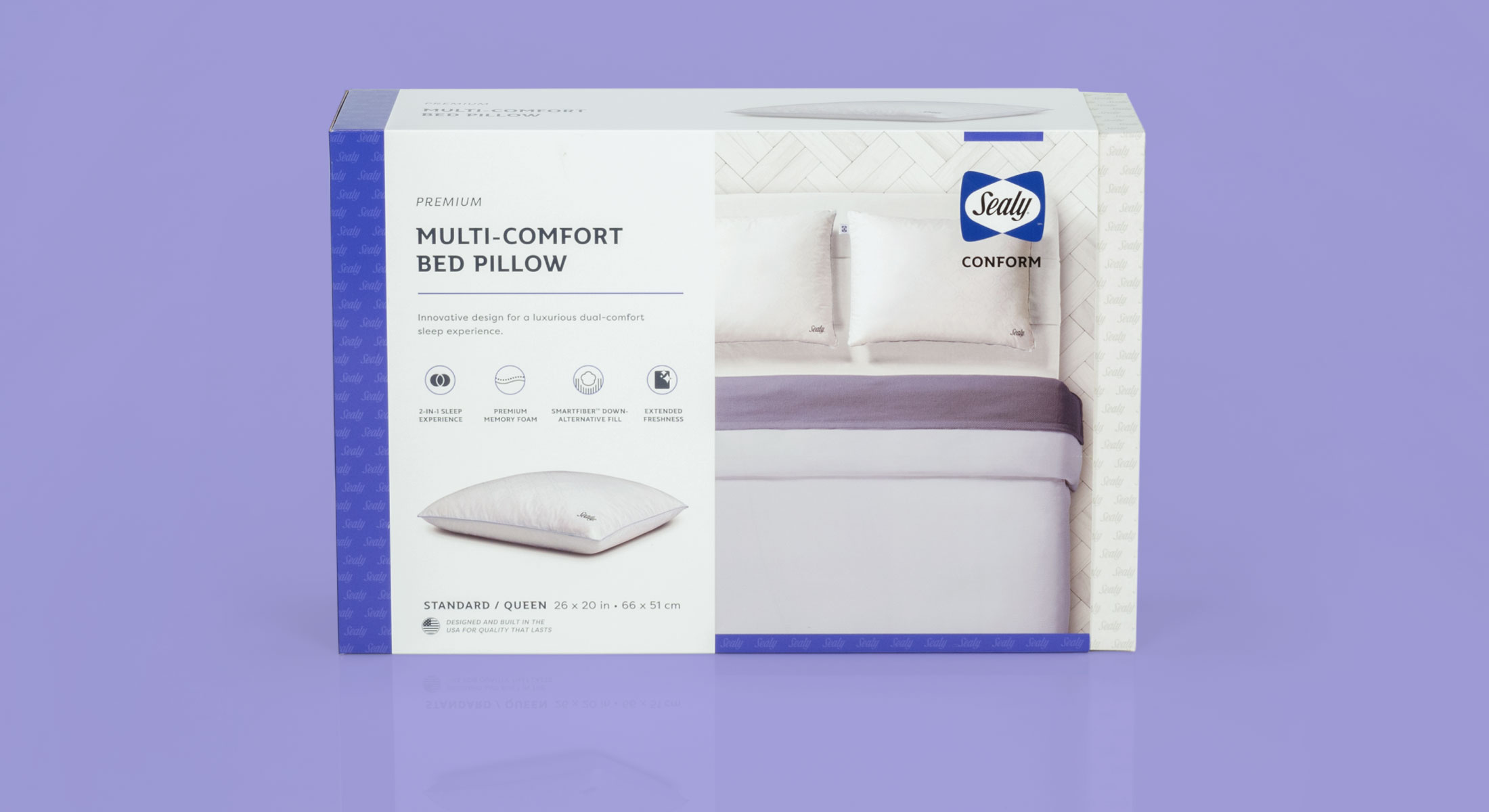
The BOLTGROUP design team created a complete packaging architecture using both visual and verbal design languages. Items such as structure, material, color, pattern, finishing, and copywriting were employed to tier the packaging across three current channels, while being mindful to leave room for expansion into future product lines. Good-better-best names—Essentials, Conform, and Response—were used to differentiate the individual lines.
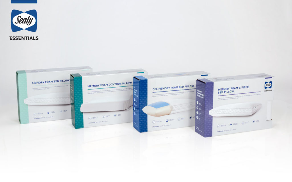
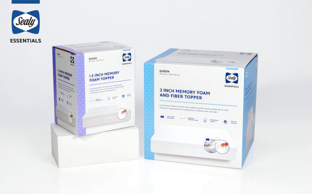
- Essentials: Good Tier. Package design elements included a single box with cutout for consumers to interact with the product. A light gray background minimally accented with a range of cool colors was used that related to the Conform and Response lines. Isolated product photography suggested an entry-level line of packaging.
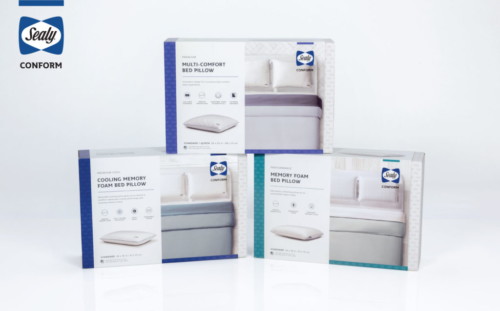
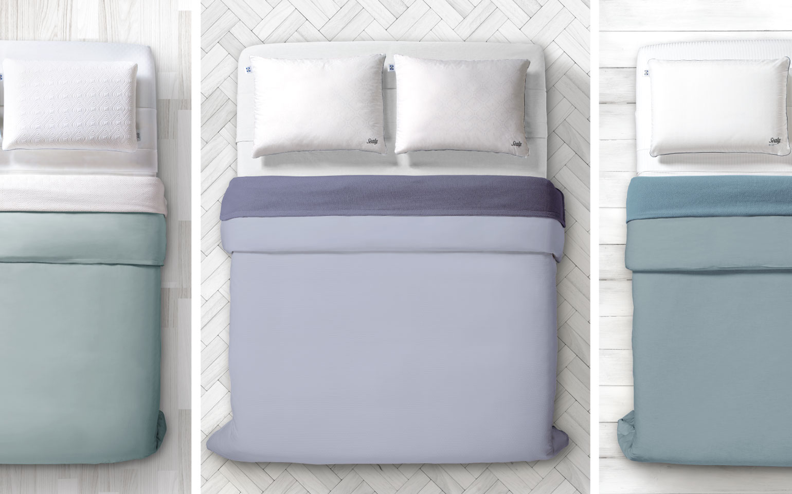
- Conform: Better Tier. Here, a double box with white inner box and no cutout was used. The design featured a white background with saturated accent colors, isolated product photography, and overhead room scene photography. This helped position the product line a step above the opening price point Essentials line.
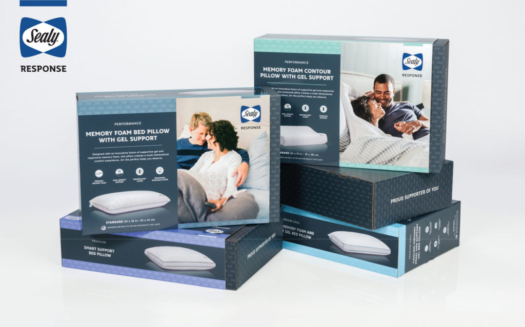
- Response: Best Tier. Reaching for a top target, a double box, charcoal palette, and inner box with no cutout was chosen. The charcoal background with muted accent colors and isolated product photography paired with emotive Sealy lifestyle photography provided a luxurious appeal to the top-tier consumer.
To curb costs over time, BOLTGROUP developed an inner box with graphic sleeve construction. While allowing multiple products to fit in fewer inner boxes, the design team kept the packaging SKU count down. And with simple, one-color repeating pattern on these inner boxes, they also doubled as self-shippers for web orders, which retained a similar brand experience across brick-and-mortar and online retailers.
Result
- This tiered collection of retail packaging achieves design harmony visually and systematically that creates the heightened retail brand experience Sealy needed across all retail levels.