

TEMPUR-PEDIC SERENITY
Calm in the Storm: Brand Strategy | Packaging Design
What do you do when your marketing environment is like a noisy parade? And your target audience is harried and hurried? How to entice and capture with calm and color.What We Did
In-Store Research
Brand Strategy
Brand Naming Strategy
Visual Identity System and Logo Design
Brand Color Palette
Retail Packaging Design
Visual Retail Merchandising
Pallet Display Design
Brand Collateral Design and Package Insert
Brand Research
Creative Art Direction
Challenge
Tempur-Pedic was looking for a way to attract and capture the busy club store shopper with sales on bedding accessories through their license with Comfort Revolution, while staying true to the Tempur-Pedic luxury brand position. In essence, the challenge was to create a whole new shopping experience for the Tempur-Pedic product in stores like Costco.
Solution
BOLTGROUP’s first task was to truly understand the setting and shopper through in-store research. Once results were compiled and analyzed, we created an overall brand strategy. Then the creative and design team took the lead.
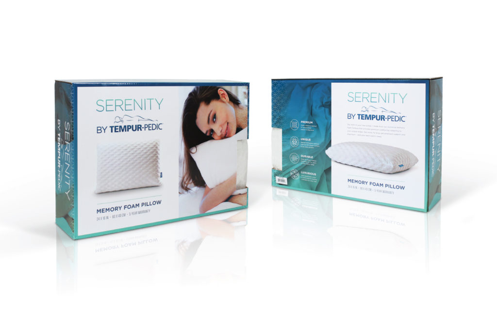
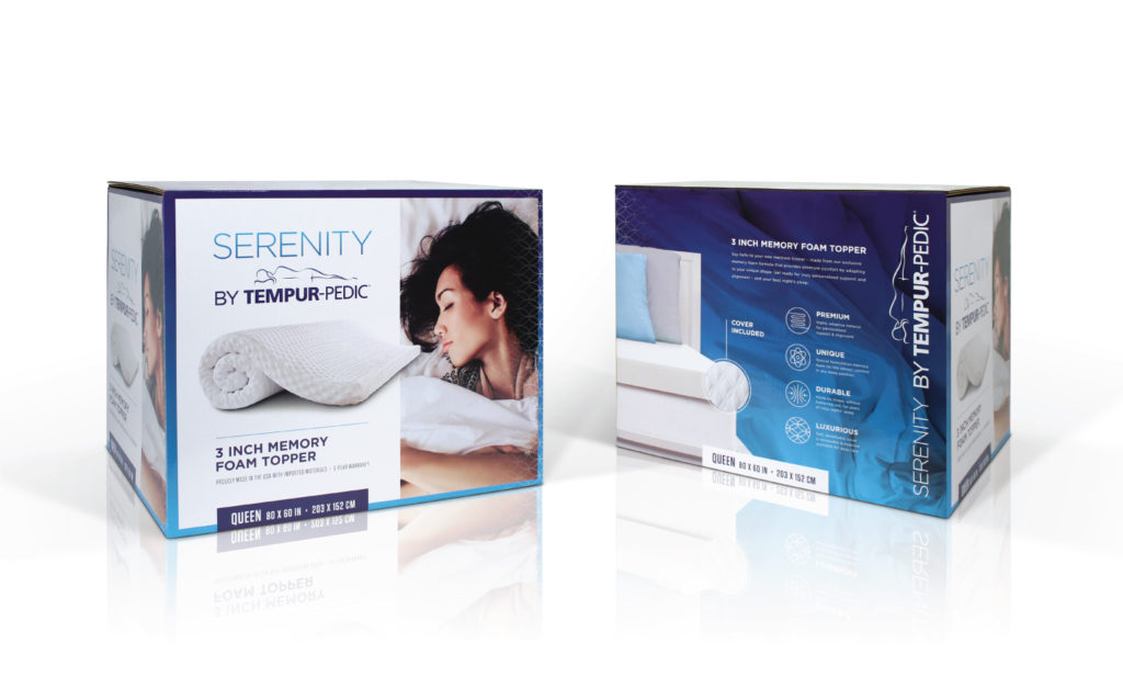
The name “Serenity”, promising calm and ease in the hectic club environment, was coupled with the familiar, respected Tempur-Pedic brand. And to communicate a bright, slightly edgier feel, clean white and bright colored gradients with minimal patterns were used. Isolated product photography of the tasteful tick and stitch patterns delivered quick product benefit identification. Finally, an emotional draw using aspirational, modern, lifestyle imagery attracted the targeted female consumer.
Result
- Fresh, bright imagery in packaging
- Displays that pop off the shelf and cut through the “noise” of a club store environment